Olga Kusterer
Main page
→
Resume
→
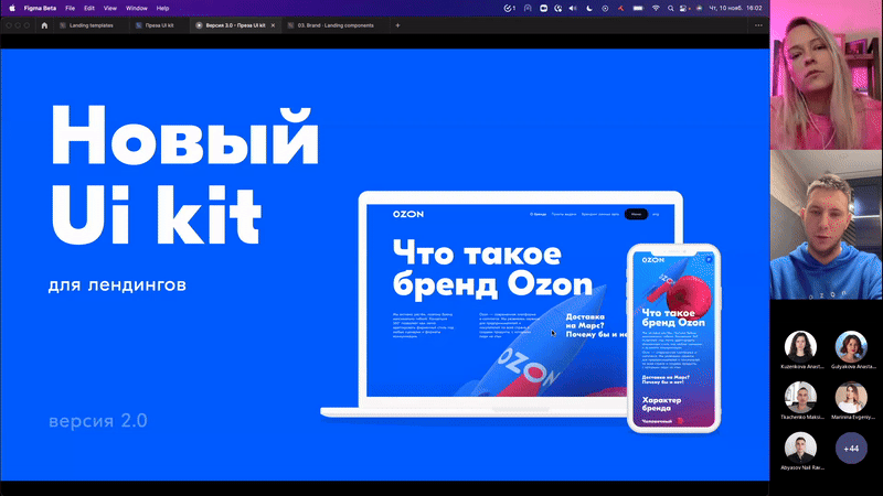
Landing Page UI kit
The admin system for creating and sending all types of emails reduced business expenses by eliminating the need for subscriptions to third-party email services.
With over 300 designers at Ozon and new landing page tasks every week, we created a design system to maintain consistent styles, colors, and typography. This reduced editing and approval time—designers now only need to update content and tweak the layout.
Unified UI Kit: 80% Faster Page Creation + Foundation for In-House Builder 🔥
Project Objective
This project was launched to address page design inconsistencies with the objective of creating approved libraries for styles, typography, and colors. Its goal was to create a more efficient design cycle and prevent new landing pages from having a negative impact on the brand.
My Role
I was tasked with redesigning our email layouts and developing an intuitive email builder. This involved the following steps:
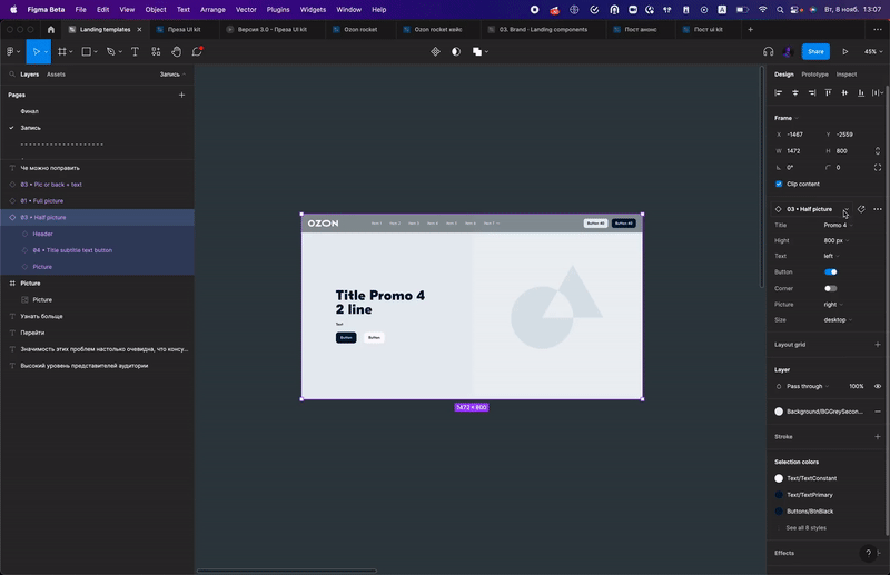
- Creating a master library containing blocks, font pairs, buttons, and letter structure templates.
- Designing and testing email headers, bodies, and footers, including iterative adjustments to ensure a style consistent with our branding principles.
- Developing the email builder, which templates the majority of the email creation process.
- Providing training sessions on how to use the new tool, as well as to better understand our brand principles.
Challenges
- Create a wide range of options for designers so they can complete any task. This encompassed creating blocks that were interchangeable, and adjusting images, colors, and fonts to ensure consistency with the brand.
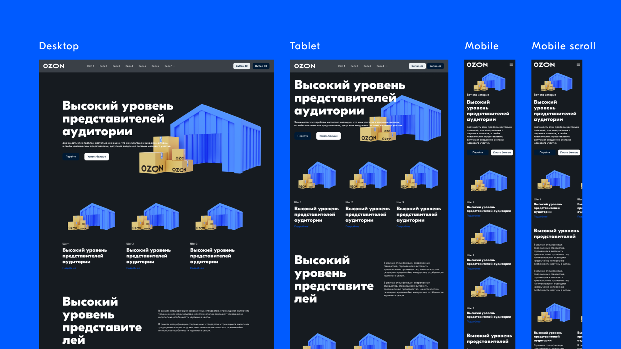
- Develop an adaptive design. Assets needed to be adaptable so that minimal effort was required to transition between desktop, mobile, and tablet.
- Ensure company-wide adoption. Designers, developers, and managers needed training and support on the tool.
- Made a tool that designs and codes landing pages at the same time, with one-click publishing.
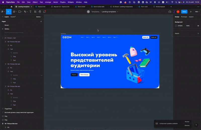
First, research popular landing pages
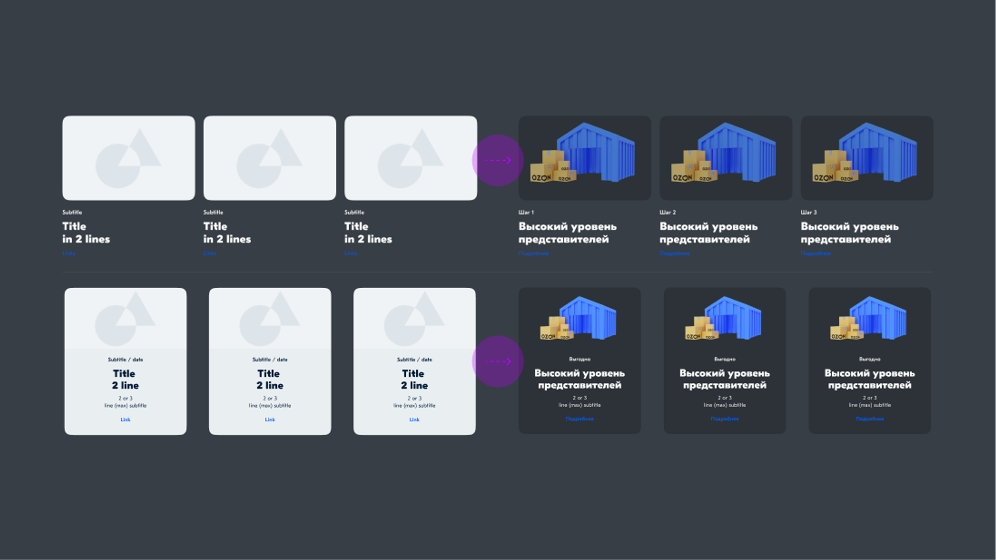
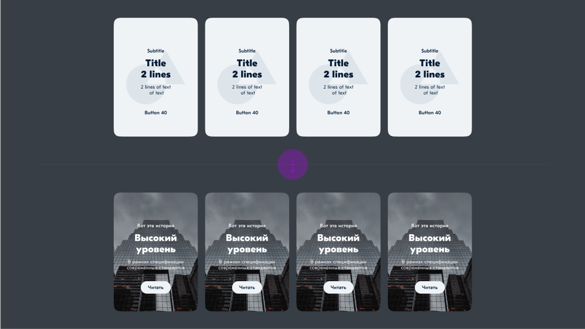
We began with research, analyzing the most popular blocks and layouts to prioritize updates based on usage. Many high-performing blocks shared similar structures, but varied in typography, image size, and visual style.
Using this data, we built a unified system by standardizing typography, border radii, and colors (with dark mode), adding branded gradients and a reusable 3D image gallery.
The result:A refreshed, modern visual system that keeps proven patterns, but saves designers time through flexible, interchangeable blocks.
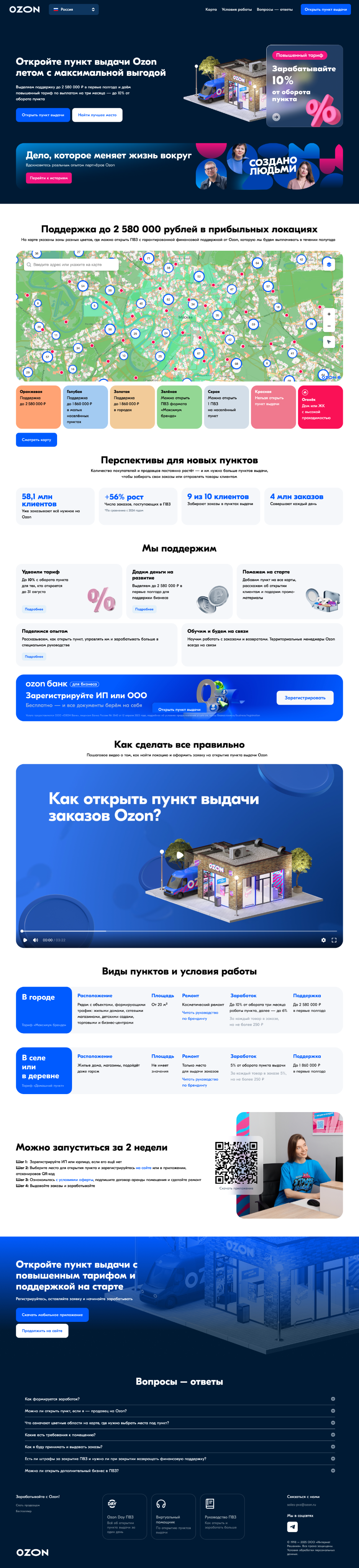
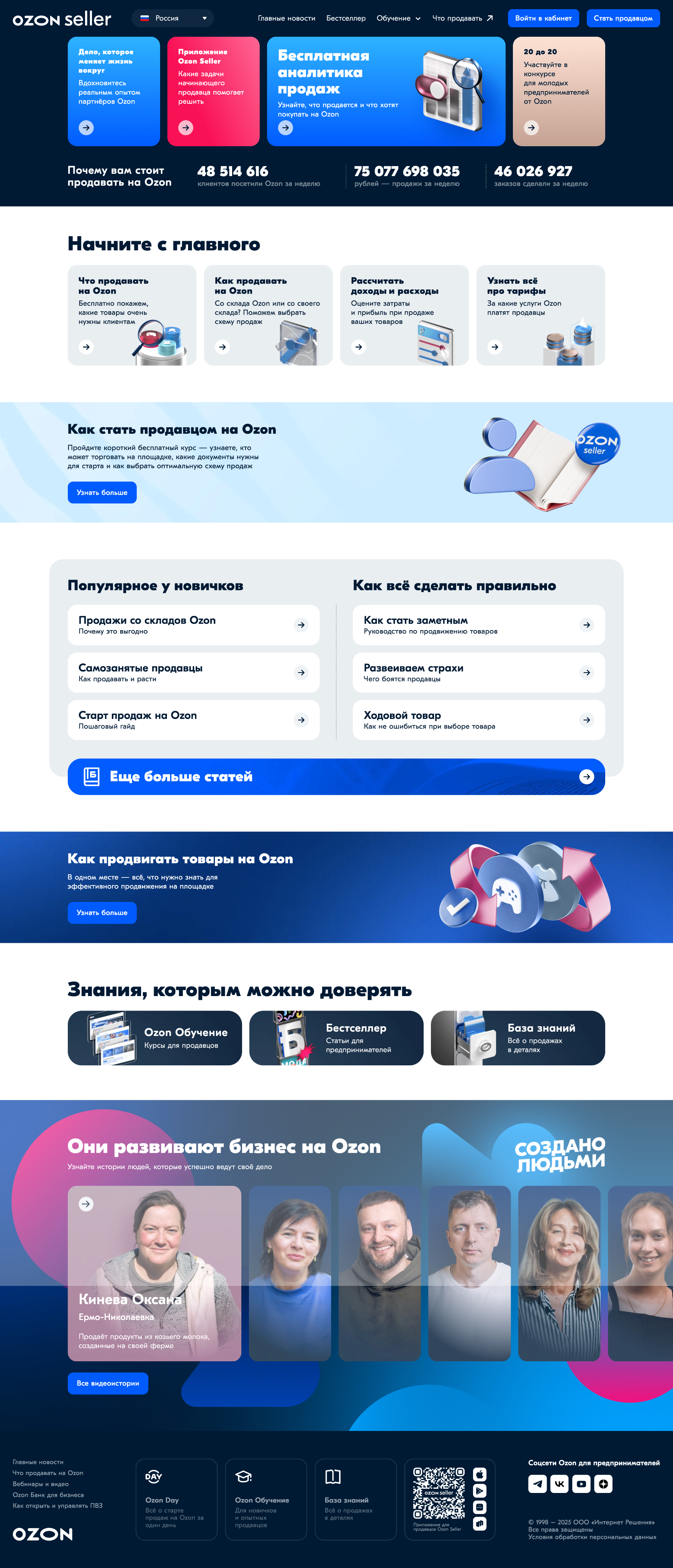
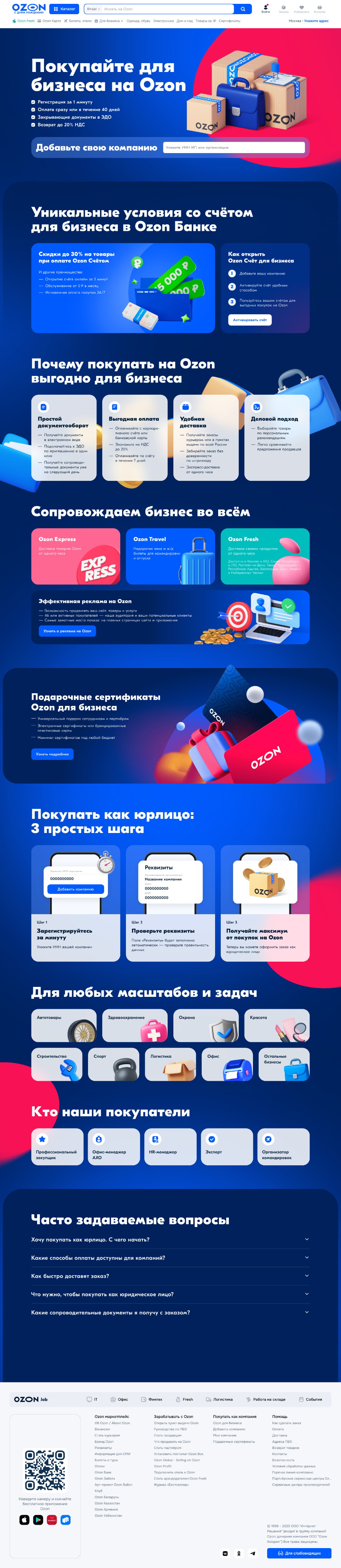
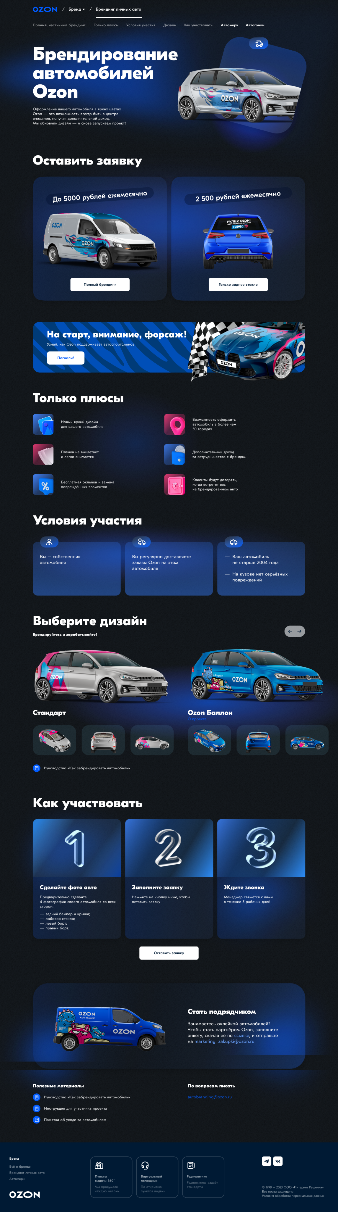
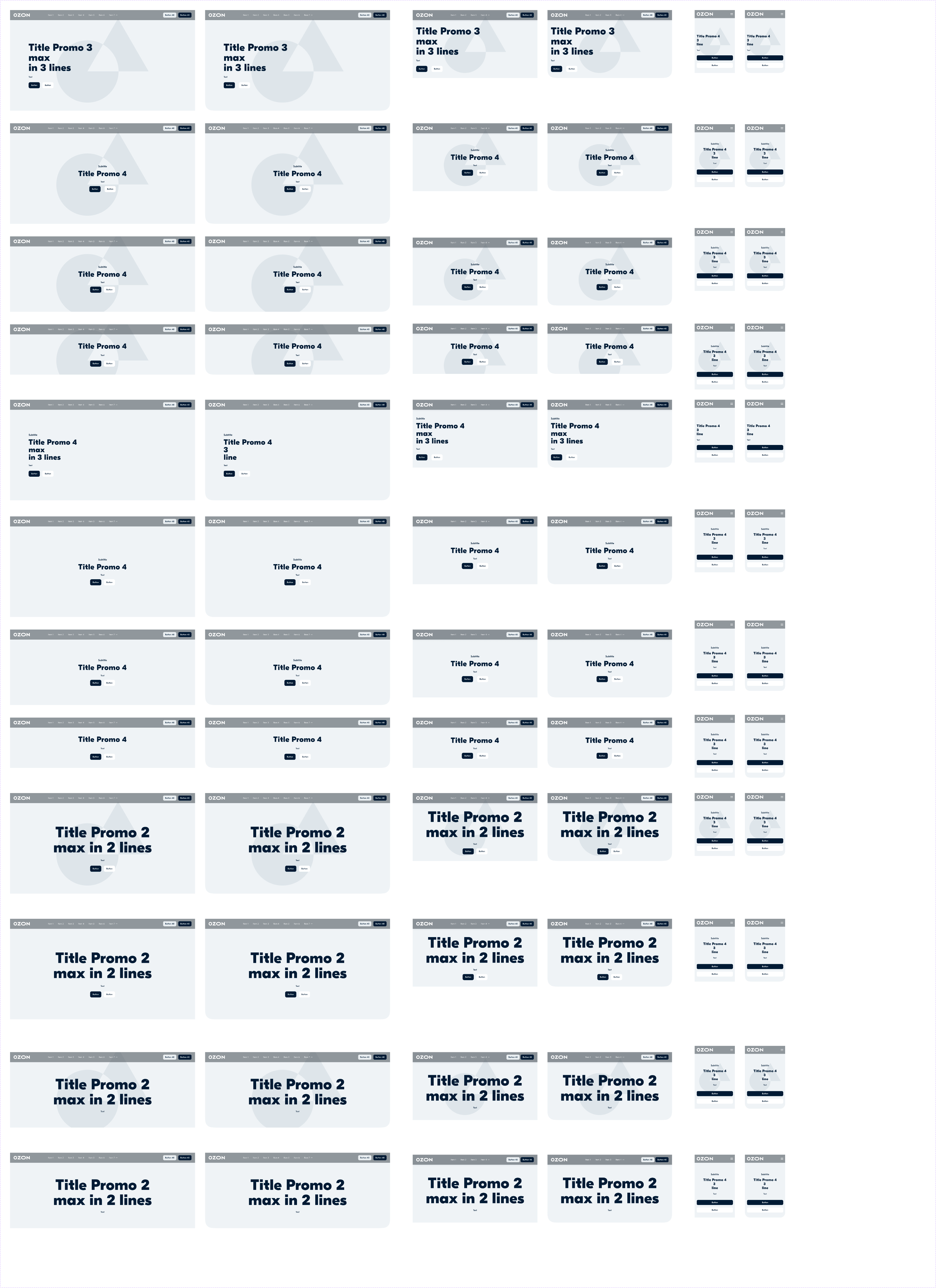
Landing Page Examples and How They’re Structured.
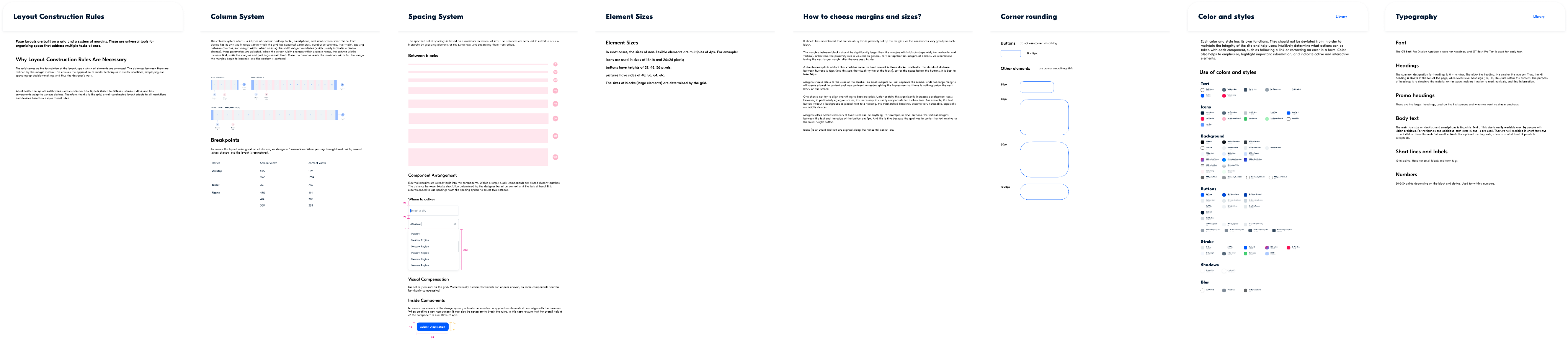
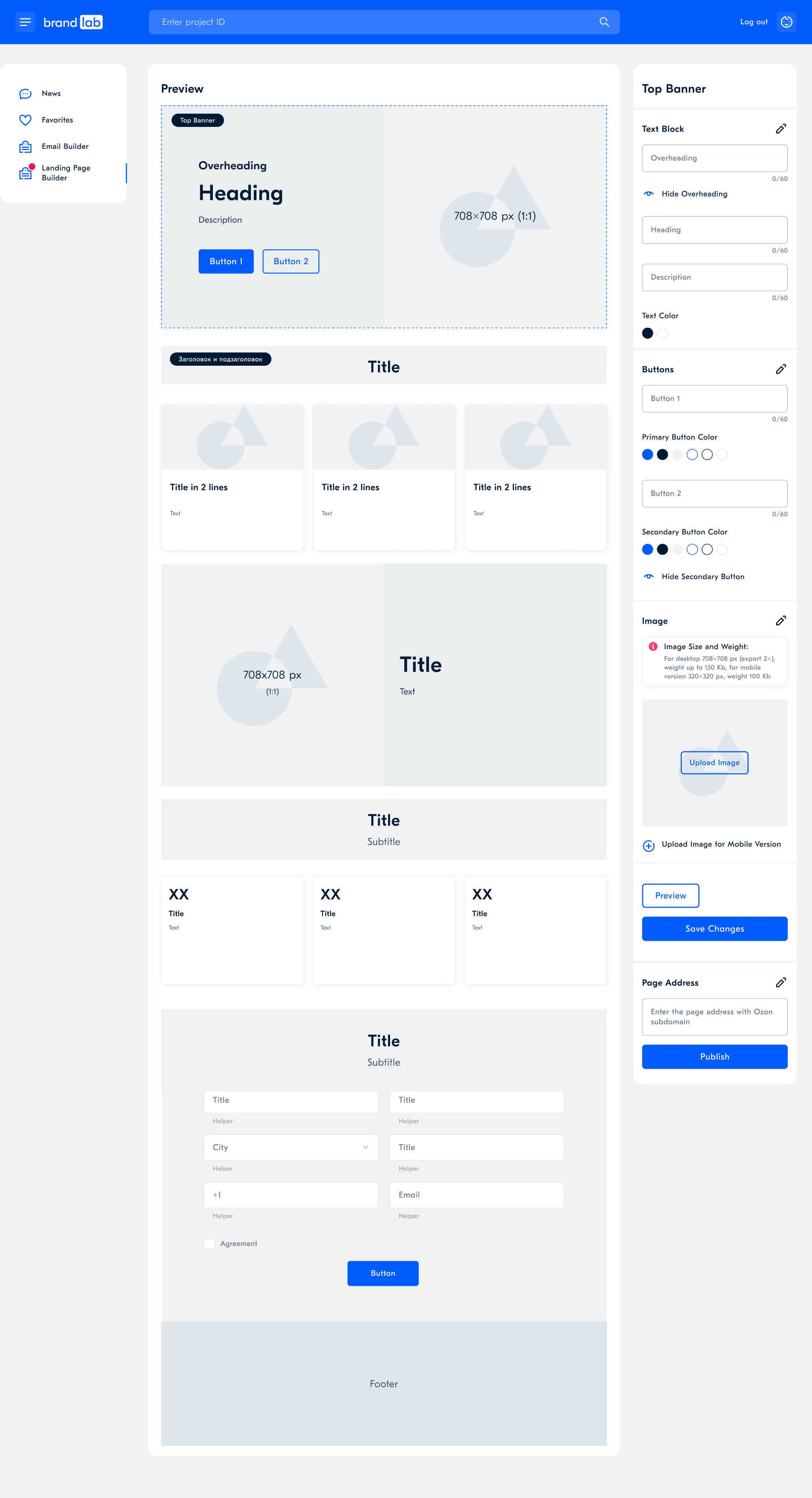
After analyzing the necessary components, we created a unified style for all blocks. We refined the typography, colors, corner radius, spacing, and even built an image library and a gradient library. As a result, the design became consistent, and we no longer needed to code similar blocks from scratch each time. All blocks were turned into components with switchable variations and grouped into 38 categories.
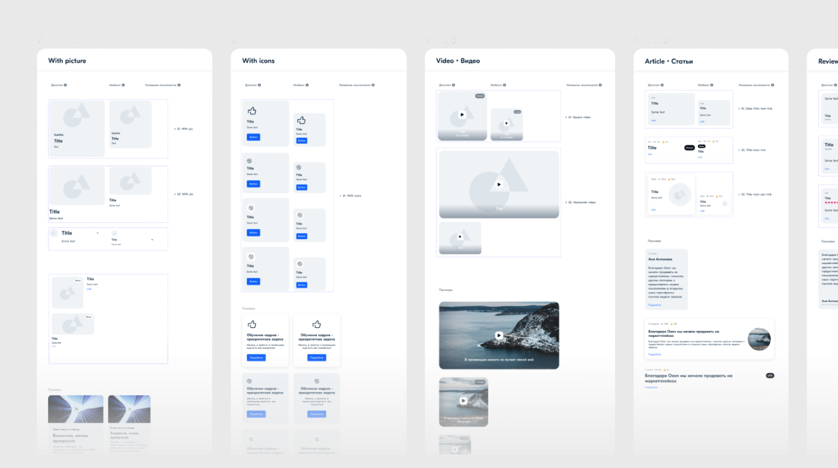
UI Kit. We developed a detailed visual library to present our design rules. Each component included organizational elements such as section titles, links to further documentation, and usage examples.
Navigation & Guidelines: A Key Part of an Informative UI Kit
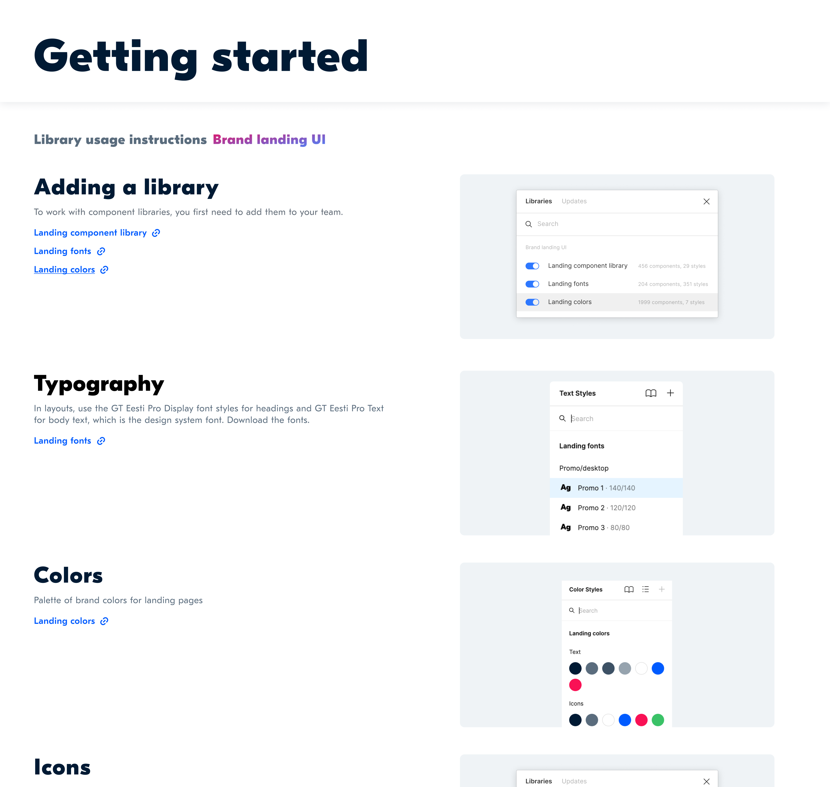
Library Usage Guidelines
We developed a detailed visual library to present our design rules. Each component included organizational elements such as section titles, links to further documentation, and usage examples.
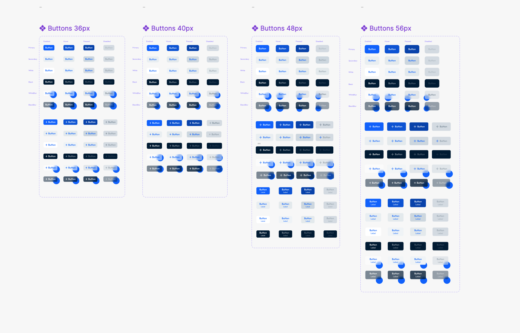
Buttons
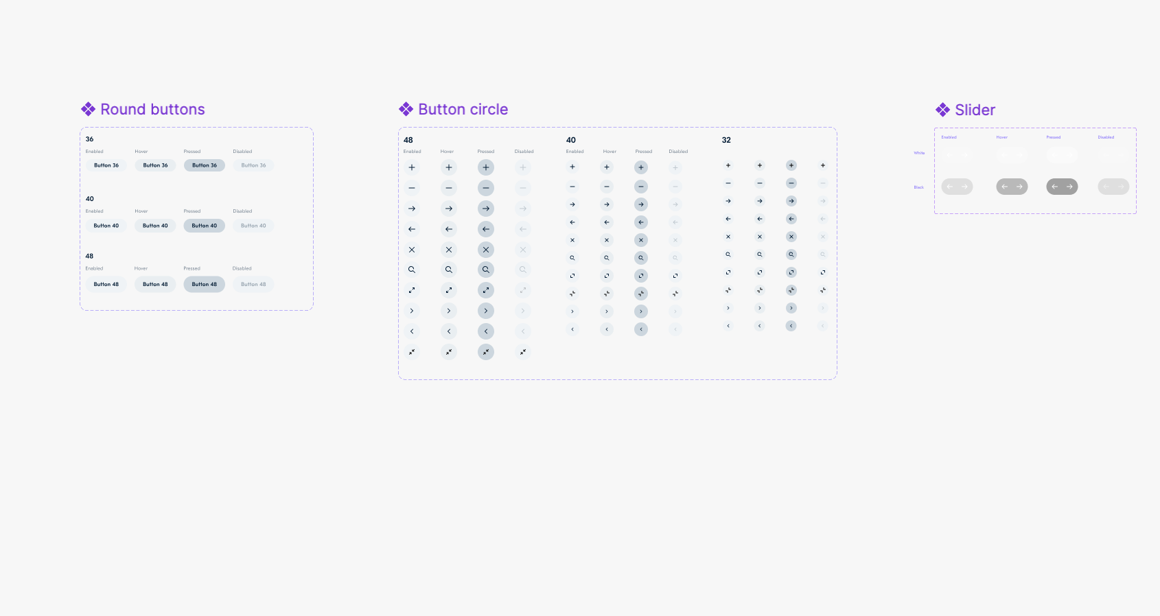
Library Styles
Components
We prepared a wide range of solutions for all possible tasks, which laid the foundation for a future landing page builder.
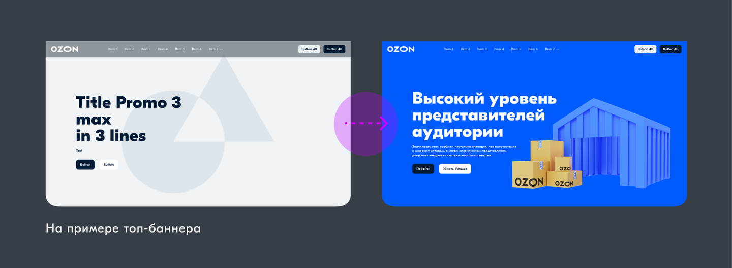
Top Banners. A design for any screen can be assembled in less than a minute. Any design can be chosen for any content.
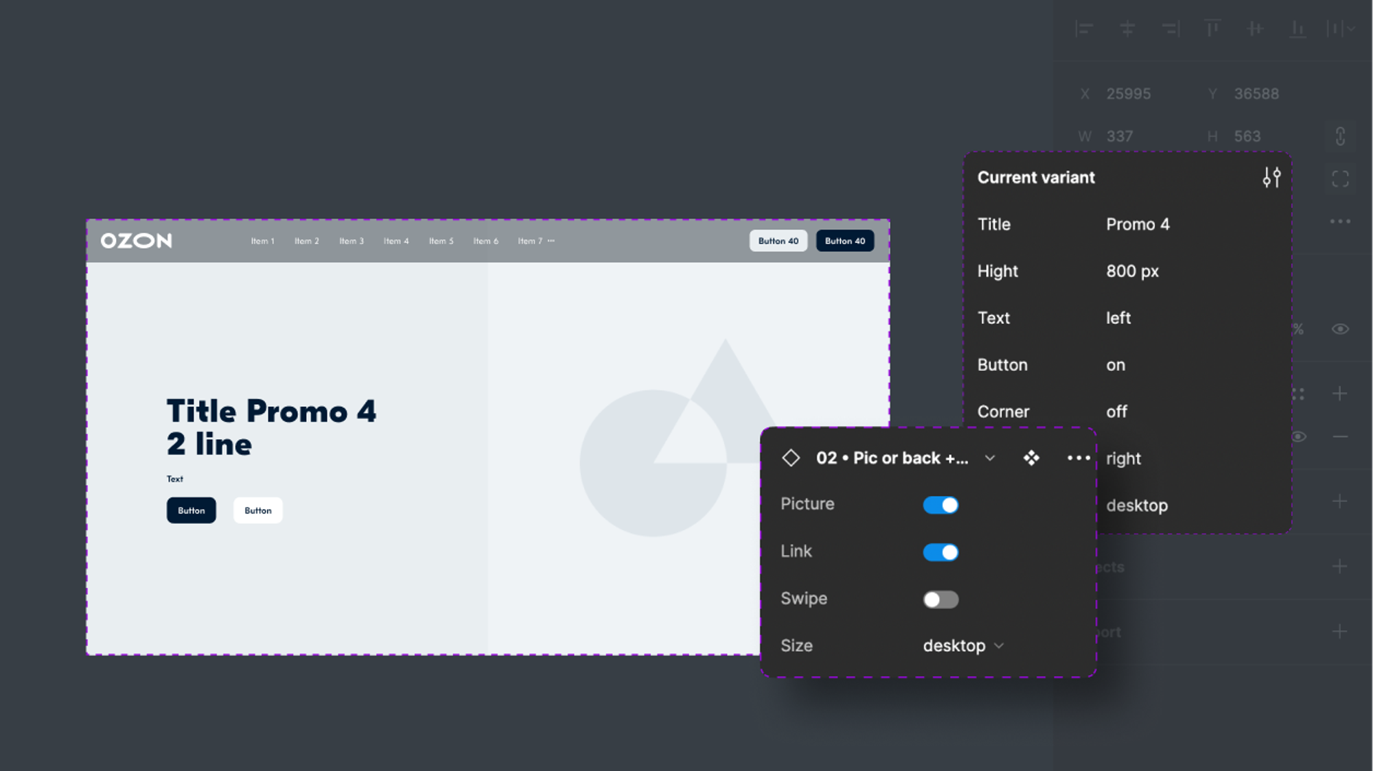
Variability. All components have variability. You can quickly adjust them to your project by changing the font size, centering text, removing illustrations, changing colors, or adding a variety of buttons.
The components were based on the best solutions from our existing landing pages. Well-structured components in the Figma library allow designers to build websites using blocks and cards, quickly adapting them while preserving all the content.
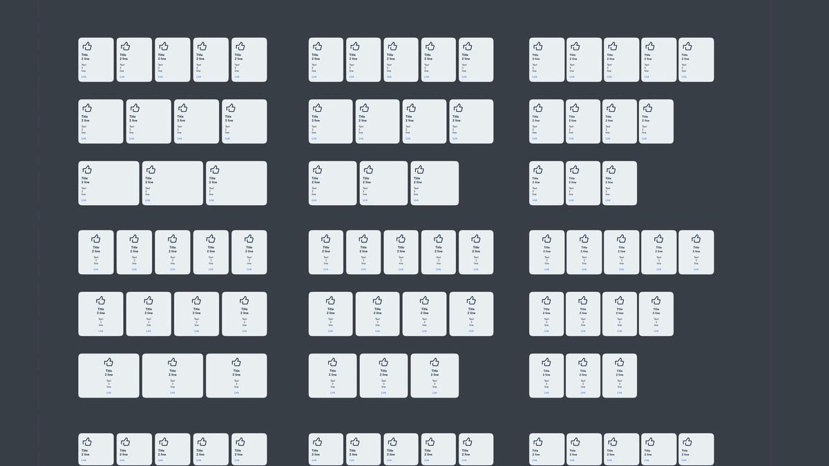
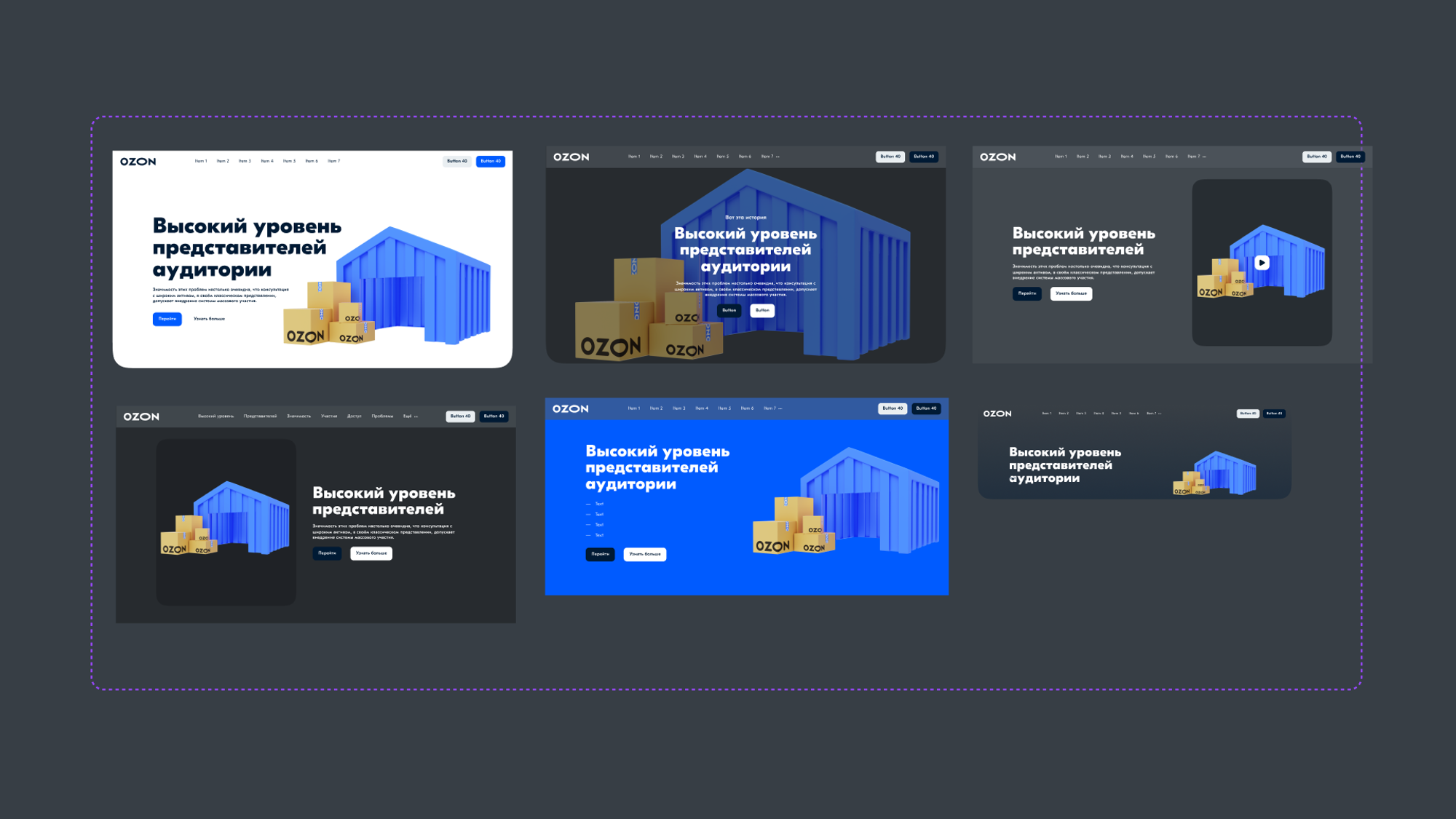
Many Cards to Diversify our Landing Pages 🔥. Our design team receives a large amount of diverse requests for creating landing pages (instructional materials, promotional campaigns, seller pages, collaborative art projects, and more). We developed a diverse range of blocks that work seamlessly together to support their needs. Below is a small sample of the cards we created.
305
Adaptive card options
54
Promo banner options
75
Options for banner dividers
48
Button options
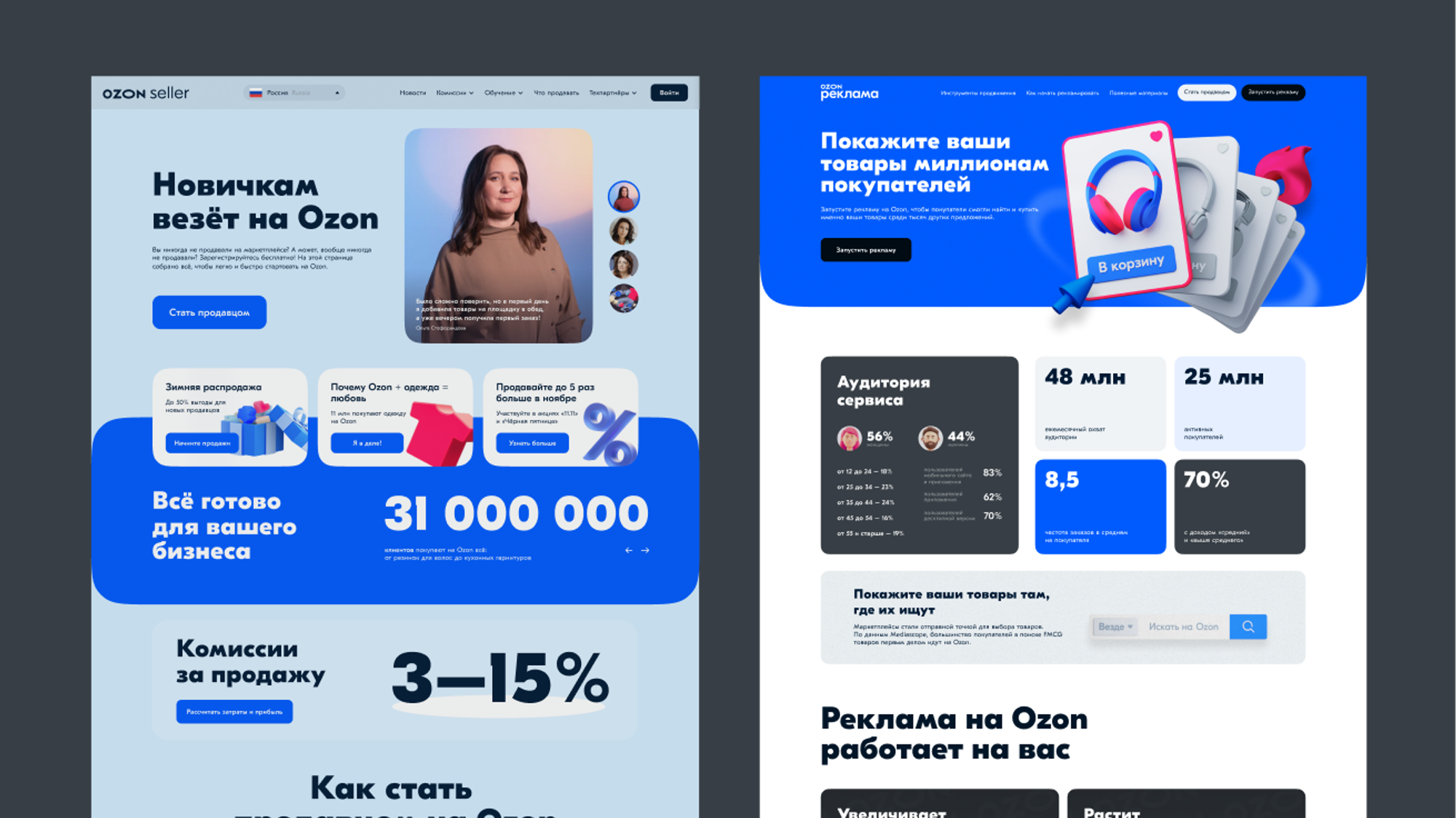
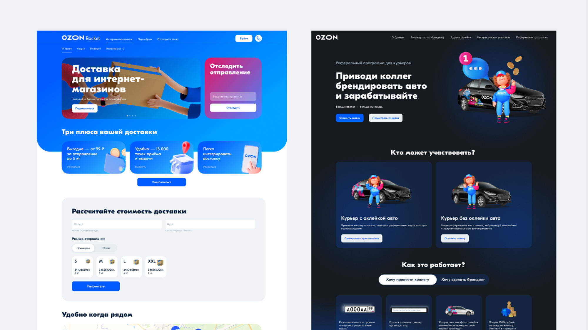
Examples of Pages Built from the New UI Kit
Company-Wide Adoption
We shared our project with the company at a Design Talks conference. Our developers were very interested in our well-thought-out blocks, especially because they cover all company tasks very well and very quickly. We scaled the components across all teams in a single storybook and began training each team how to use the new system.
Landing page builder (beta)
The landing page builder includes reusable blocks and components, incorporates all brand styles and font pairings, and has significantly accelerated the landing page creation process — saving the company both time and money.
Key Learnings
This goal — to speed up landing page creation — was something we set for ourselves. I learned how to work closely with my team, break down big tasks into smaller ones, and my designers were quick to pick up pieces of the UI kit. We tested and swapped components live, right in the process.
We love simplifying workflows, cutting long product chains, and eliminating the need for third-party tools. I’m really glad our team was always given the green light for initiatives like this one.
Credits
Olga Kusterer
Collected and refined the most popular blocks. Led the project and introduced new blocks based on requests. Prepared everything for the landing page builder.
Gleb Bobylkov
Product Designer helped refine the blocks and ensure proper block switching logic.
Katya Baranova
Visual Designer helped create the library styles and integrate them into the design system.
Maria Ananina
Project Manager and Team Lead.
Olga Kusterer
Main page
→
Resume
→
Landing Page UI kit
The admin system for creating and sending all types of emails reduced business expenses by eliminating the need for subscriptions to third-party email services.
With over 300 designers at Ozon and new landing page tasks every week, we created a design system to maintain consistent styles, colors, and typography. This reduced editing and approval time—designers now only need to update content and tweak the layout.
Unified UI Kit: 80% Faster Page Creation + Foundation for In-House Builder 🔥
Project Objective
This project was launched to address page design inconsistencies with the objective of creating approved libraries for styles, typography, and colors. Its goal was to create a more efficient design cycle and prevent new landing pages from having a negative impact on the brand.
My Role
I was tasked with redesigning our email layouts and developing an intuitive email builder. This involved the following steps:
- Creating a master library containing blocks, font pairs, buttons, and letter structure templates.
- Designing and testing email headers, bodies, and footers, including iterative adjustments to ensure a style consistent with our branding principles.
- Developing the email builder, which templates the majority of the email creation process.
- Providing training sessions on how to use the new tool, as well as to better understand our brand principles.
Challenges
- Create a wide range of options for designers so they can complete any task. This encompassed creating blocks that were interchangeable, and adjusting images, colors, and fonts to ensure consistency with the brand.
- Develop an adaptive design. Assets needed to be adaptable so that minimal effort was required to transition between desktop, mobile, and tablet.
- Ensure company-wide adoption. Designers, developers, and managers needed training and support on the tool.
- Made a tool that designs and codes landing pages at the same time, with one-click publishing.
First, research popular landing pages
We began with research, analyzing the most popular blocks and layouts to prioritize updates based on usage. Many high-performing blocks shared similar structures, but varied in typography, image size, and visual style.
Using this data, we built a unified system by standardizing typography, border radii, and colors (with dark mode), adding branded gradients and a reusable 3D image gallery.
The result:A refreshed, modern visual system that keeps proven patterns, but saves designers time through flexible, interchangeable blocks.
Landing Page Examples and How They’re Structured.
After analyzing the necessary components, we created a unified style for all blocks. We refined the typography, colors, corner radius, spacing, and even built an image library and a gradient library. As a result, the design became consistent, and we no longer needed to code similar blocks from scratch each time. All blocks were turned into components with switchable variations and grouped into 38 categories.
UI Kit. We developed a detailed visual library to present our design rules. Each component included organizational elements such as section titles, links to further documentation, and usage examples.
Navigation & Guidelines: A Key Part of an Informative UI Kit
Library Usage Guidelines
We developed a detailed visual library to present our design rules. Each component included organizational elements such as section titles, links to further documentation, and usage examples.
Buttons
Library Styles
Components
We prepared a wide range of solutions for all possible tasks, which laid the foundation for a future landing page builder.
Top Banners. A design for any screen can be assembled in less than a minute. Any design can be chosen for any content.
Variability. All components have variability. You can quickly adjust them to your project by changing the font size, centering text, removing illustrations, changing colors, or adding a variety of buttons.
The components were based on the best solutions from our existing landing pages. Well-structured components in the Figma library allow designers to build websites using blocks and cards, quickly adapting them while preserving all the content.
Many Cards to Diversify our Landing Pages 🔥. Our design team receives a large amount of diverse requests for creating landing pages (instructional materials, promotional campaigns, seller pages, collaborative art projects, and more). We developed a diverse range of blocks that work seamlessly together to support their needs. Below is a small sample of the cards we created.
305
Adaptive card options
54
Promo banner options
75
Options for banner dividers
48
Button options
Examples of Pages Built from the New UI Kit
Company-Wide Adoption
We shared our project with the company at a Design Talks conference. Our developers were very interested in our well-thought-out blocks, especially because they cover all company tasks very well and very quickly. We scaled the components across all teams in a single storybook and began training each team how to use the new system.
Landing page builder (beta)
The landing page builder includes reusable blocks and components, incorporates all brand styles and font pairings, and has significantly accelerated the landing page creation process — saving the company both time and money.
Key Learnings
This goal — to speed up landing page creation — was something we set for ourselves. I learned how to work closely with my team, break down big tasks into smaller ones, and my designers were quick to pick up pieces of the UI kit. We tested and swapped components live, right in the process.
We love simplifying workflows, cutting long product chains, and eliminating the need for third-party tools. I’m really glad our team was always given the green light for initiatives like this one.
Credits
Olga Kusterer
Collected and refined the most popular blocks. Led the project and introduced new blocks based on requests. Prepared everything for the landing page builder.
Gleb Bobylkov
Product Designer helped refine the blocks and ensure proper block switching logic.
Katya Baranova
Visual Designer helped create the library styles and integrate them into the design system.
Maria Ananina
Project Manager and Team Lead.