Olga Kusterer
Main page
→
Resume
→
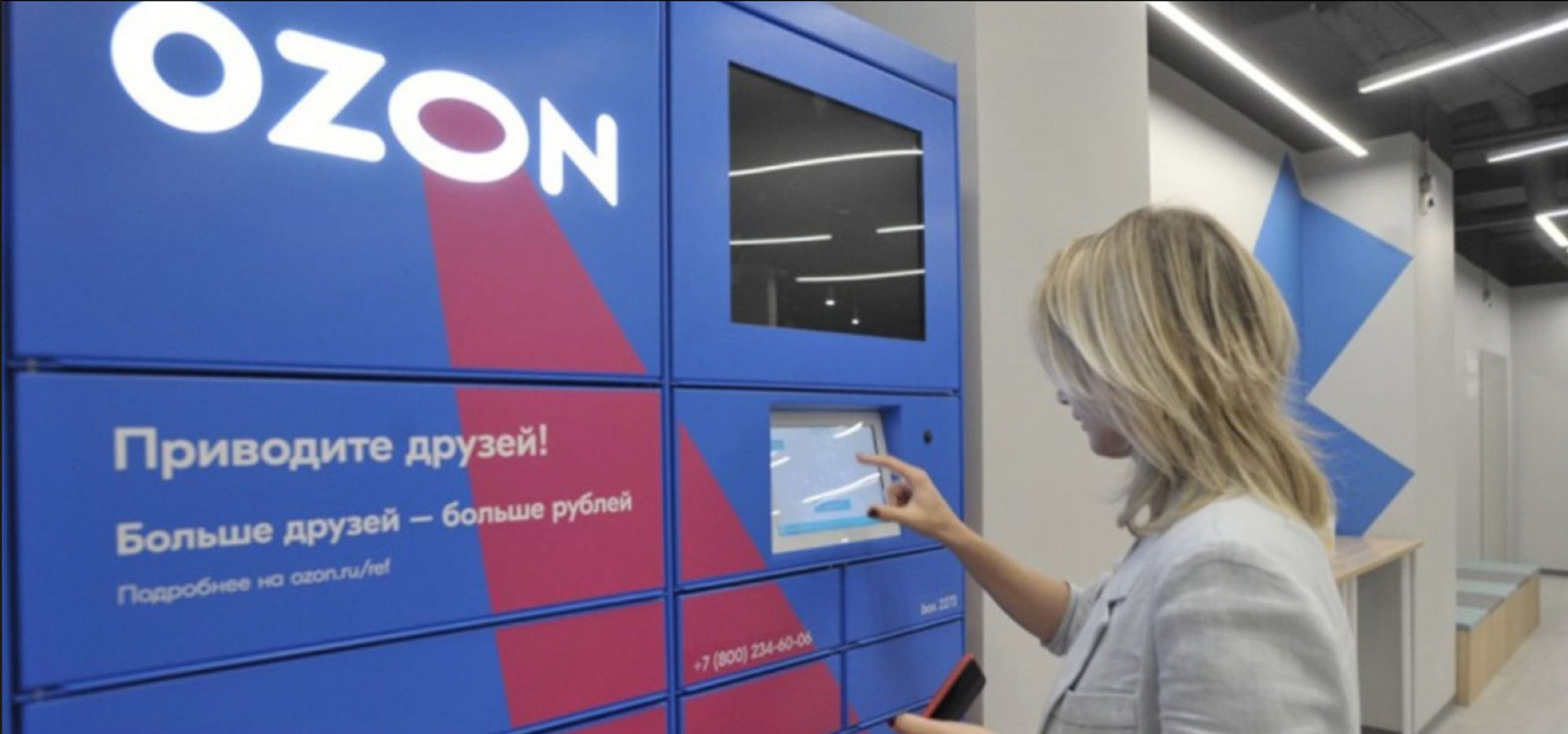
Pickup point locker interface
A pick point is a location with an Ozon package delivery locker. The main purpose of a pick point is to deliver packages to recipients at any time with less involvement from couriers or other employees. Ozon started to develop this service near the end of 2019.
Redesign Reduced Support Calls by 60% with a More Intuitive Interface!
Project Objective
Redesign the pick point interface by updating the UI kit and developing a more intuitive UX for customers, couriers, and administrators. This encompasses research, design, testing, and parallel development.
Our team was responsible for both the online and offline aspects of pick points. Online tasks included conducting user interviews, scenario planning, communicating with developers, and redesigning the interface. Offline tasks involved redesigning the visual appearance of each pick point in collaboration with local artists to make them unique and eye-catching.
I led the project as the Senior Designer, working closely with a UX/UI Designer who supported me throughout the process.
Challenges
- Redesigning the Ozon Locker Interface. Created a new interface for customers receiving parcels. Tested design directly with users at the lockers to ensure clarity and ease of use.
- Mapping and Improving Courier Journey. Analyzed each step of the courier delivery flow to lockers. Identified bottlenecks and reworked the experience to reduce errors and save time.
- Complete UI Kit Overhaul. Redesigned the entire design system for scalability and cross-platform consistency. Focused on usability, accessibility, and visual clarity.
- Prototyping and User Testing. Gathered feedback from all user groups — customers, couriers, and admins. Built wireframes and interactive prototypes, iterated through multiple rounds of testing.
Research
Together with UX-Lab, we tested the new interface on the following respondents:
The courier's script
Women
20-48 YEARS OLD

Men
23-46 YEARS OLD

The user's script
Women
24-42 YEARS OLD

Men
22-46 YEARS OLD

Task
Test the post-order interface FOR PICK UPS and returnS. Evaluate the ergonomics of the new interface.
SAMPLE
User Flow:10 respondents (5 women and 5 men) WITH AN Even AGE distribution (20-48 years OLD). Not all respondents WERE Ozon customers, nor DID all prepay FOR their orders AND/OR PRIMARILY use courier delivery.Courier flow: 8 respondents (4 WOMEN AND 4 MEN) with an even AGE distribution (22-46 years OLD). Not all HAD EXPERIENCE deliveRING orders OR PICKING UP RETURNS through terminals.
Method
Individual in-depth interviews + usability testing. We asked respondents to tell us about their previous ORDER experienceS and then HAD THEM TRY to complete an order and A return ON THE PROTOTYPE INTERFACE.
Wireframe
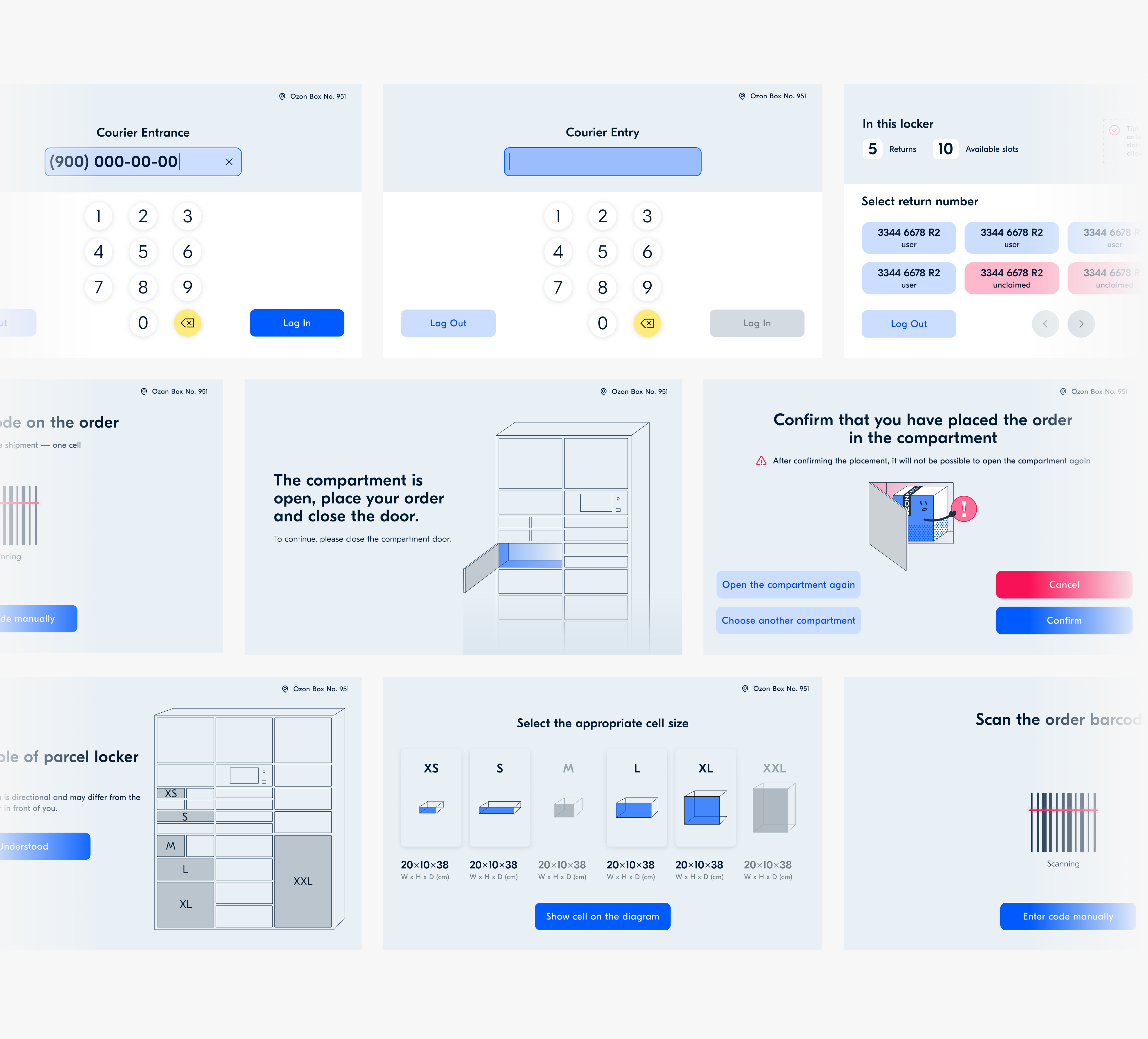
We completely redesigned the flow FOR users, couriers, AND administrators.
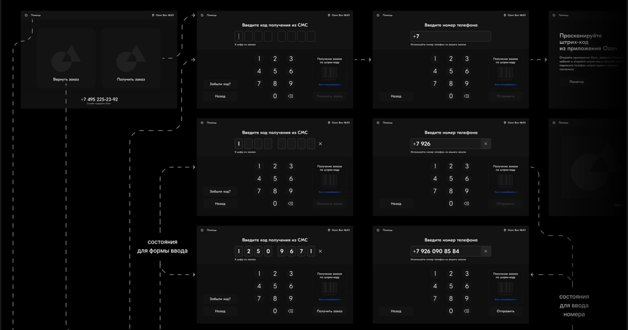
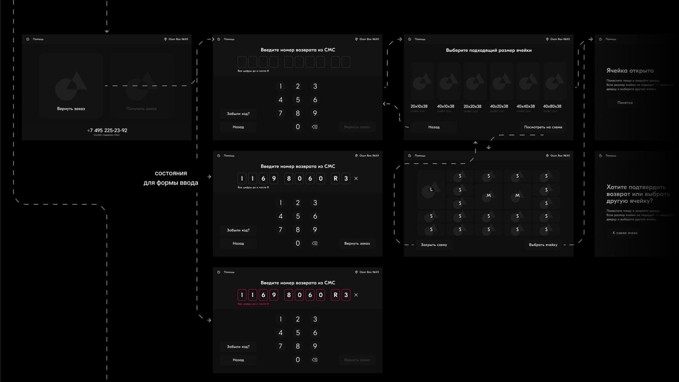
We completely redesigned our operations to benefit our users, couriers, and administrators.
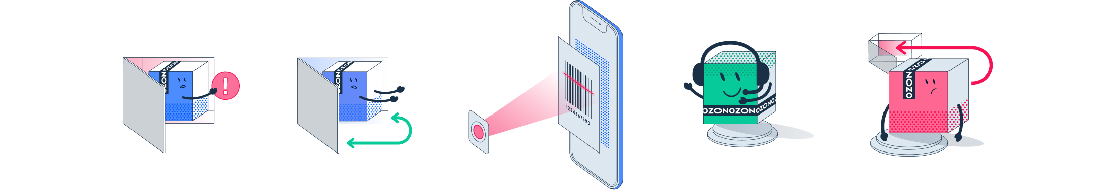
Illustrations
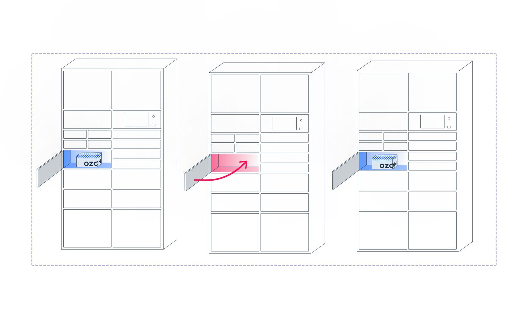
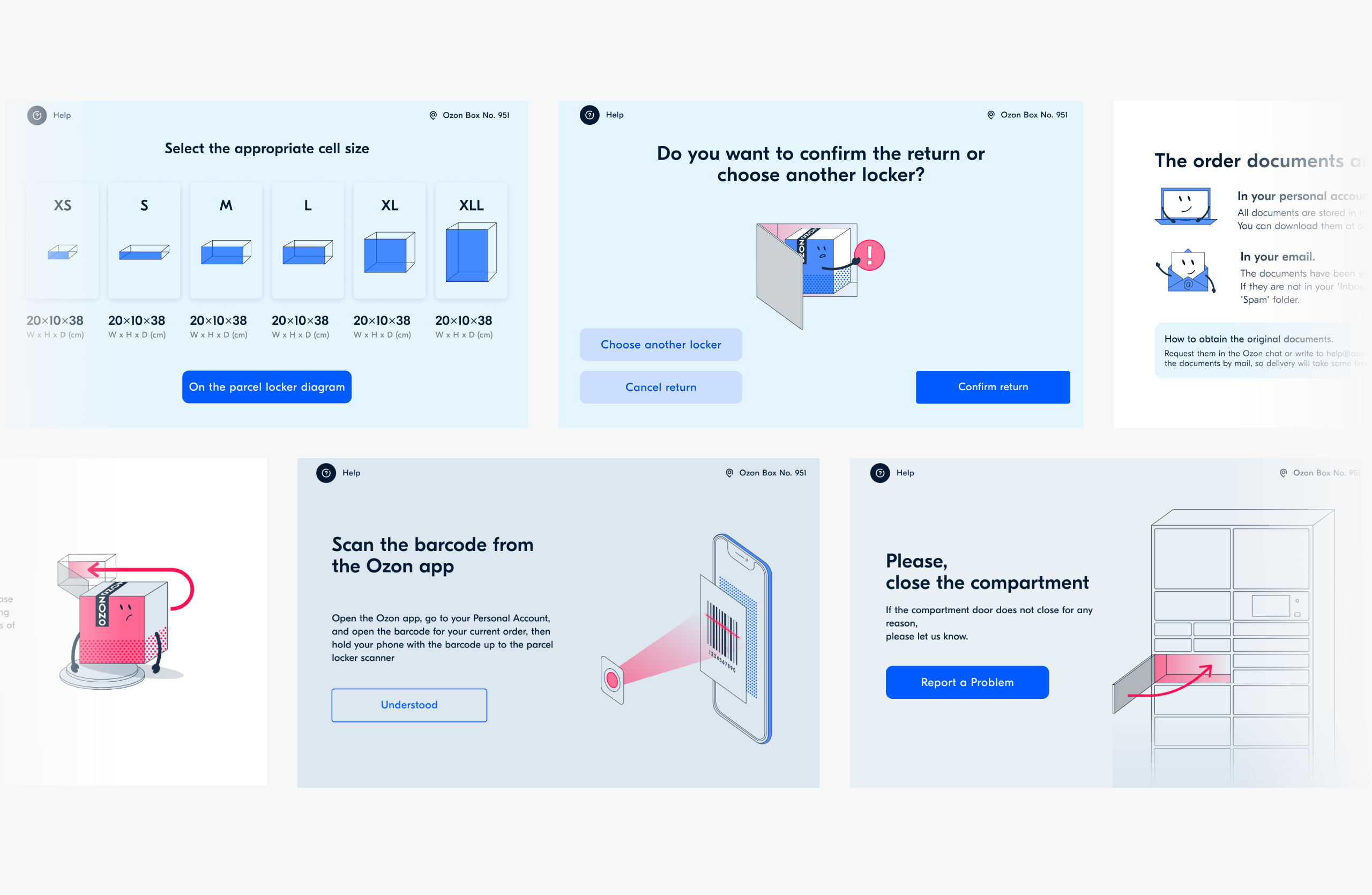
We decided to use illustrations for the user pickup tutorial. We also used illustrations to help couriers select a proper locker size. This helped all parties intuitively understand how to use our pickup points.
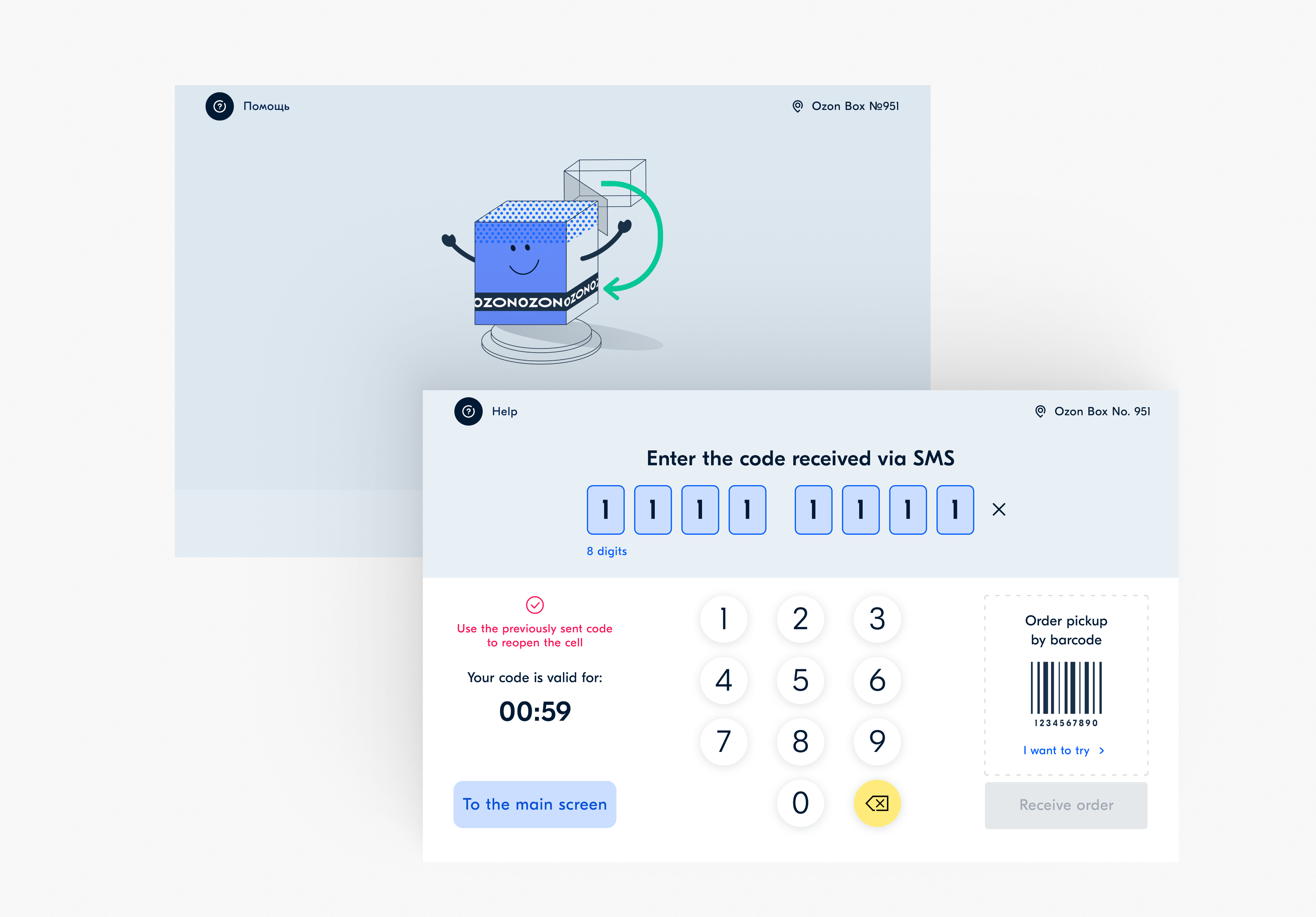
New UI and tonality
We completely updated the UI kit and redesigned its tone, making sure the instructions are no longer technical and dry. As a result, the interface became more friendly and modern.
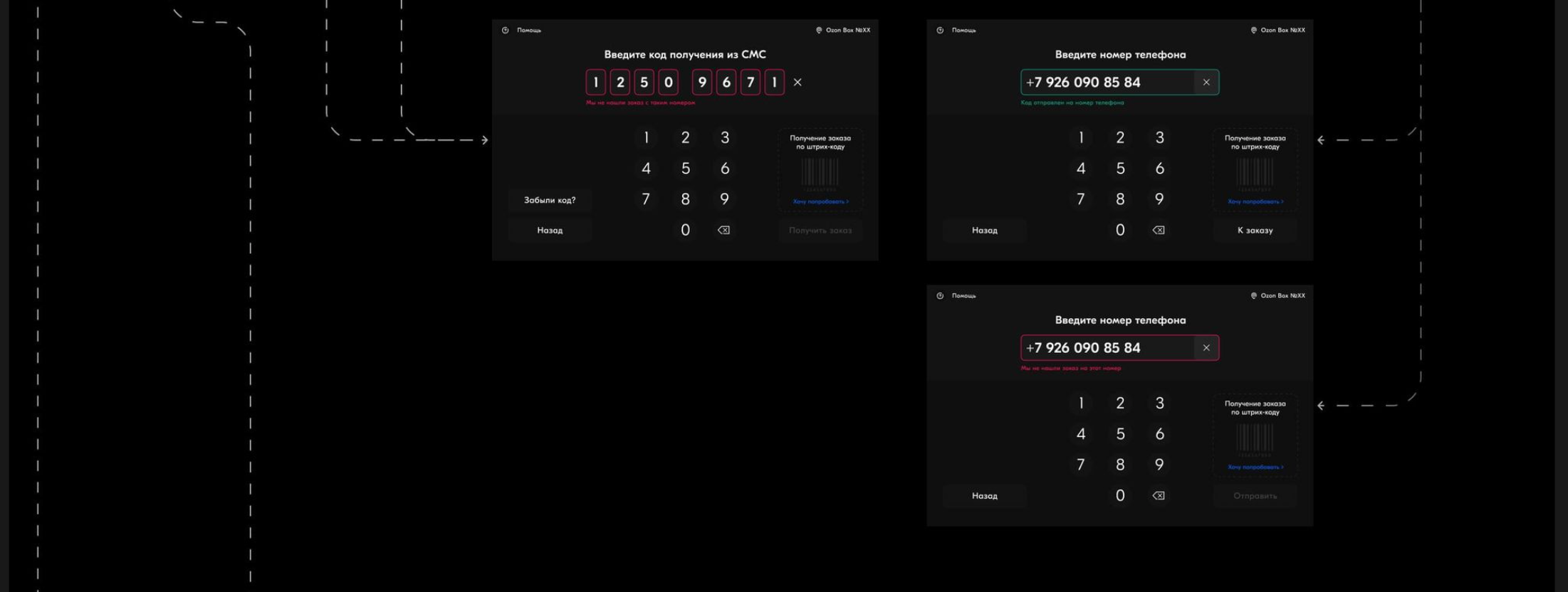
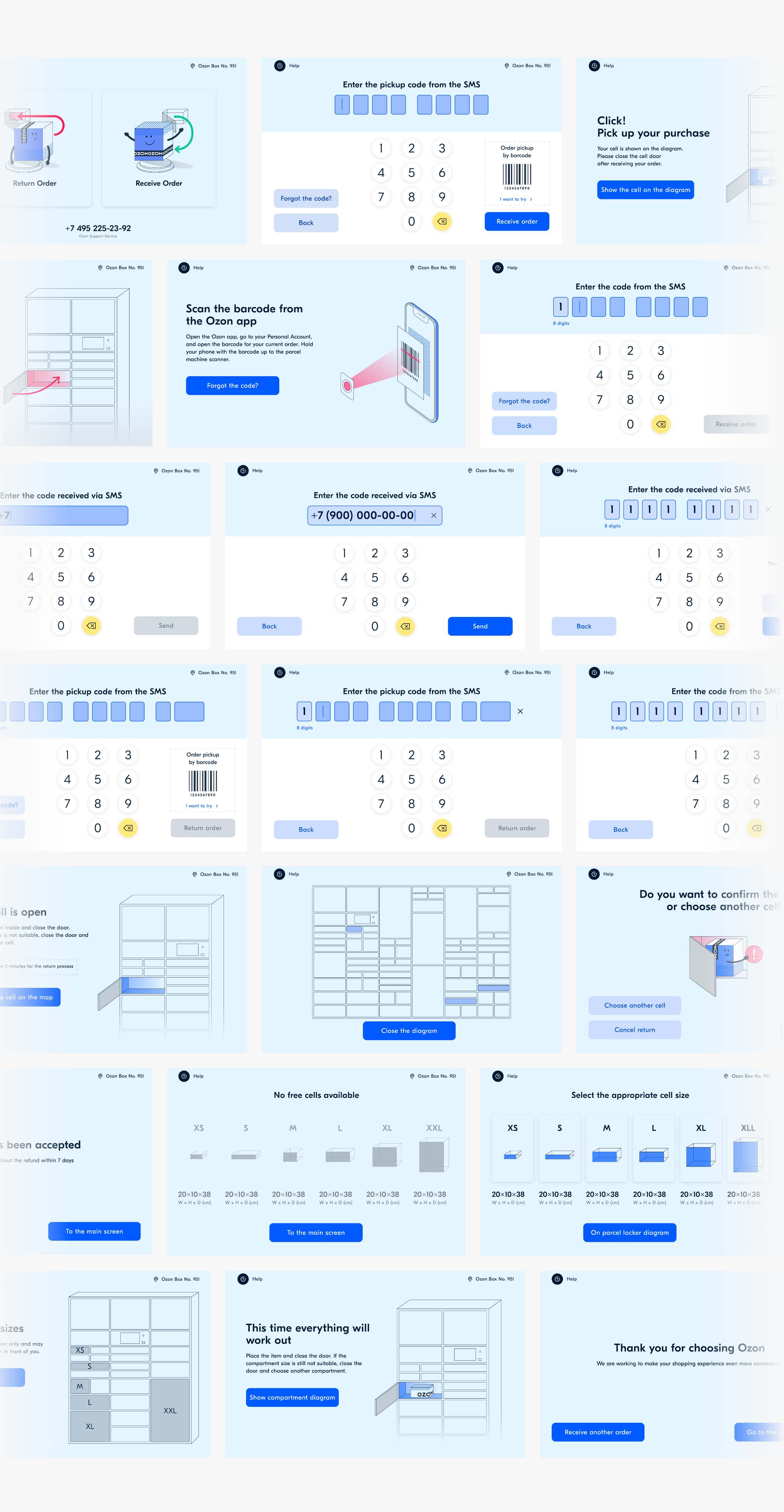
User Flow
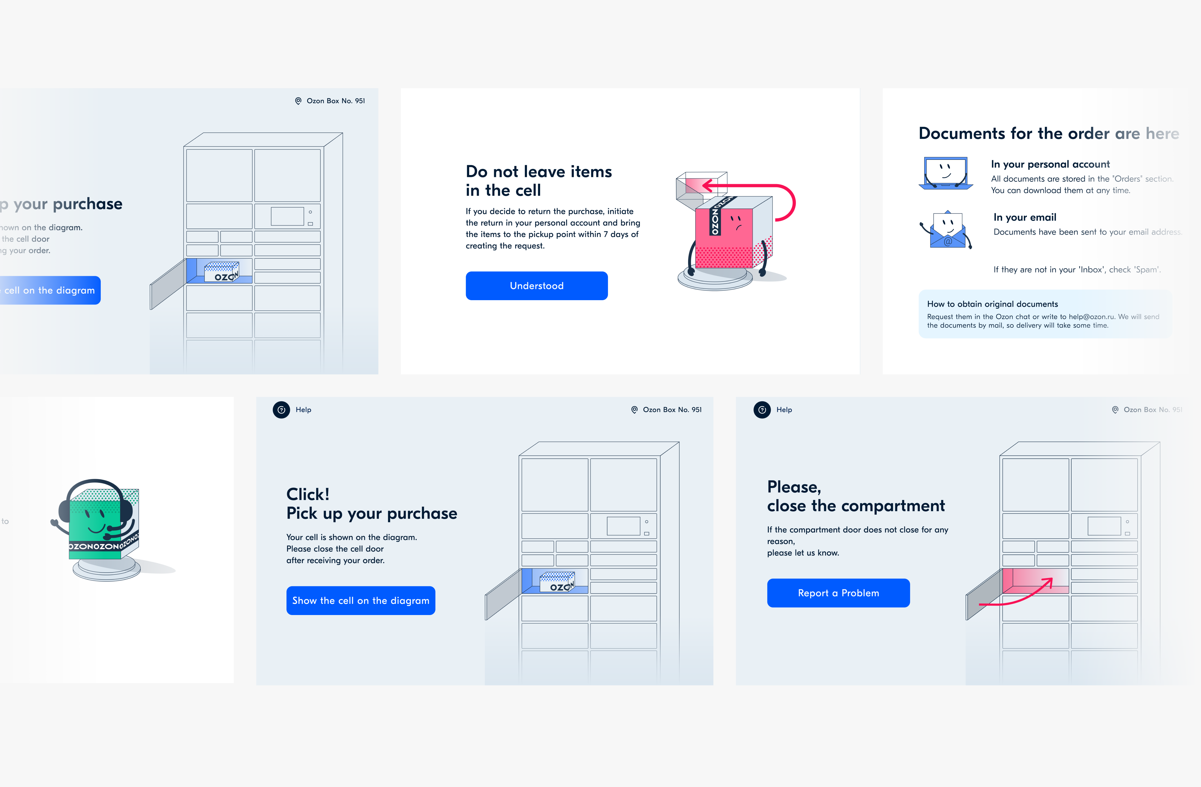
Update notice
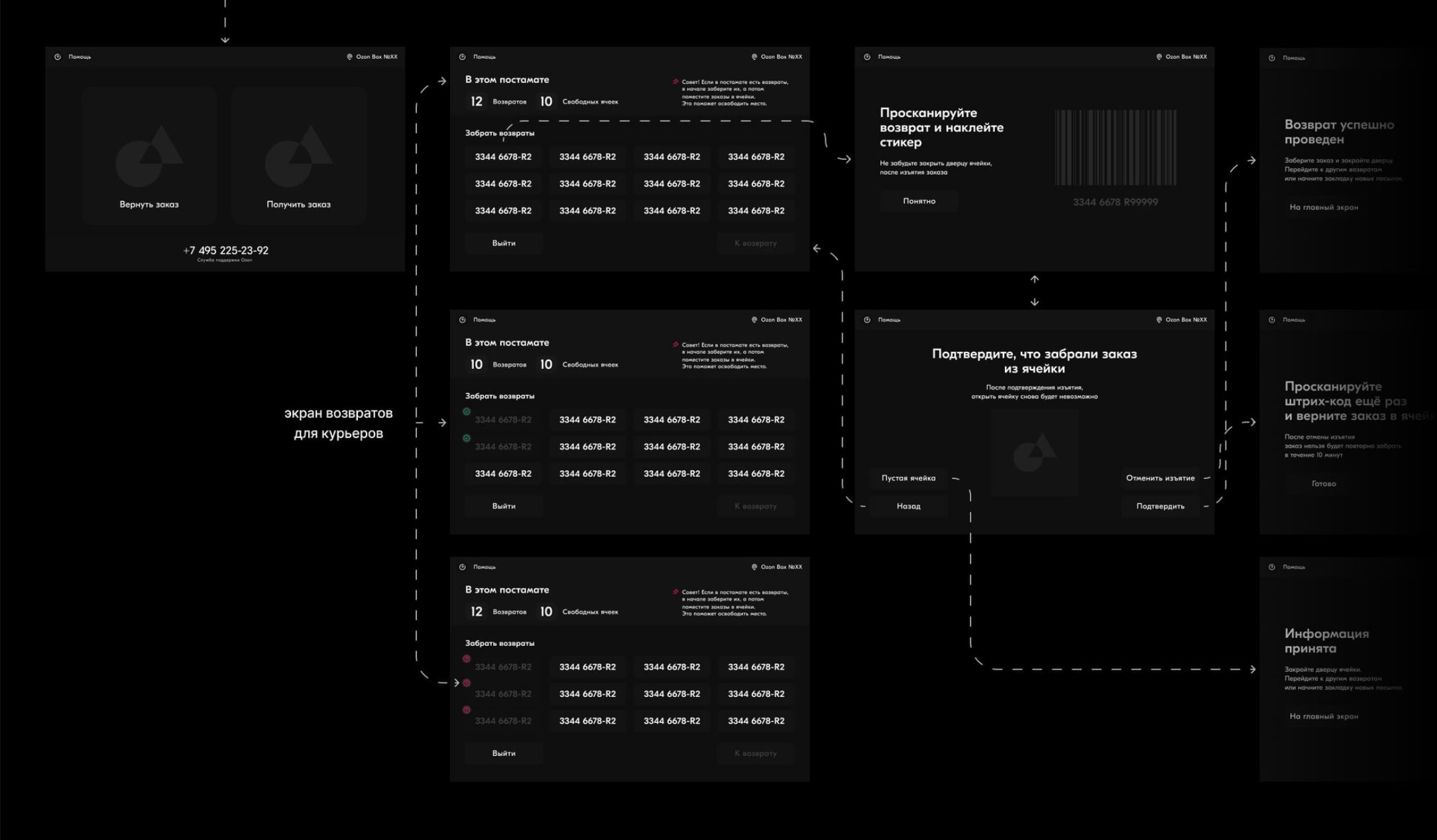
Courier flow
Collaborations
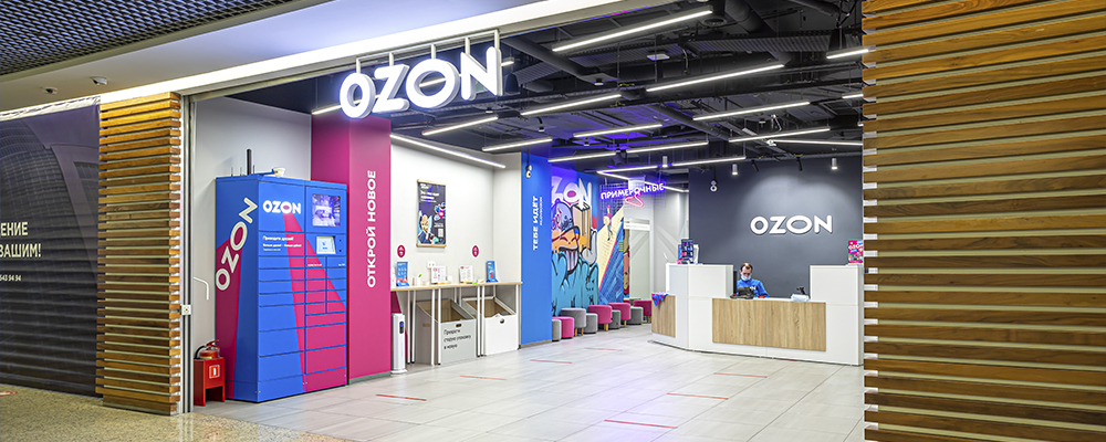
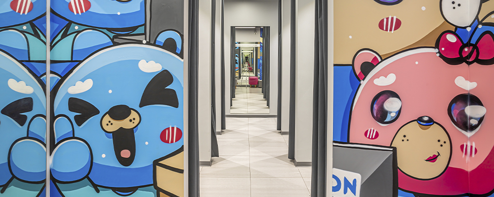
Over time, we started using lockers as an advertising medium: banners, stickers, and media ads on screens. As a result, lockers became an additional advertising touchpoint. This video demonstrates a cool artist collaboration for the special project Ozon Balloon
Key Learnings
User interviews revealed key behavioral patterns — many users tried to leave without closing the locker, but a simple illustrated reminder helped reduce such cases. Visual communication through illustrations improved clarity and led to a more intuitive experience. Clear, step-by-step guidance on placing boxes in appropriately sized lockers simplified the courier flow — no extra training was needed. Early prototype testing helped eliminate unnecessary steps and focus on real user needs. A consistent design system ensured scalability and reduced design debt. Cross-functional collaboration strengthens outcomes – Working closely with product managers, copywriters, and illustrators helped align tone of voice, visuals, and functionality into a cohesive experience.
Credits
Olga Kusterer
Contributed to the redesign of the project following user and courier interviews.
Gleb Bobylkov
Team Lead who worked on the illustrations.
Anastasia Rudneva
Team Lead who managed the project and assisted with prototype testing.
Philipp Shprints
Lead Copywriter who developed the tone of voice and user communication.
Katya Baranova
Designer who supported screen design and prototype creation.
Anna Baturina
Product Manager of the project.
Olga Kusterer
Main page
→
Resume
→
Pickup point locker interface
A pick point is a location with an Ozon package delivery locker. The main purpose of a pick point is to deliver packages to recipients at any time with less involvement from couriers or other employees. Ozon started to develop this service near the end of 2019.
Redesign Reduced Support Calls by 60% with a More Intuitive Interface!
Project Objective
Redesign the pick point interface by updating the UI kit and developing a more intuitive UX for customers, couriers, and administrators. This encompasses research, design, testing, and parallel development.
Our team was responsible for both the online and offline aspects of pick points. Online tasks included conducting user interviews, scenario planning, communicating with developers, and redesigning the interface. Offline tasks involved redesigning the visual appearance of each pick point in collaboration with local artists to make them unique and eye-catching.
I led the project as the Senior Designer, working closely with a UX/UI Designer who supported me throughout the process.
Challenges
- Redesigning the Ozon Locker Interface. Created a new interface for customers receiving parcels. Tested design directly with users at the lockers to ensure clarity and ease of use.
- Mapping and Improving Courier Journey. Analyzed each step of the courier delivery flow to lockers. Identified bottlenecks and reworked the experience to reduce errors and save time.
- Complete UI Kit Overhaul. Redesigned the entire design system for scalability and cross-platform consistency. Focused on usability, accessibility, and visual clarity.
- Prototyping and User Testing. Gathered feedback from all user groups — customers, couriers, and admins. Built wireframes and interactive prototypes, iterated through multiple rounds of testing.
Research
Together with UX-Lab, we tested the new interface on the following respondents:
The courier's script
Women
20-48 YEARS OLD
Men
23-46 YEARS OLD
The user's script
Women
24-42 YEARS OLD
Men
22-46 YEARS OLD
Task
Test the post-order interface FOR PICK UPS and returnS. Evaluate the ergonomics of the new interface.
SAMPLE
User Flow:10 respondents (5 women and 5 men) WITH AN Even AGE distribution (20-48 years OLD). Not all respondents WERE Ozon customers, nor DID all prepay FOR their orders AND/OR PRIMARILY use courier delivery.Courier flow: 8 respondents (4 WOMEN AND 4 MEN) with an even AGE distribution (22-46 years OLD). Not all HAD EXPERIENCE deliveRING orders OR PICKING UP RETURNS through terminals.
Method
Individual in-depth interviews + usability testing. We asked respondents to tell us about their previous ORDER experienceS and then HAD THEM TRY to complete an order and A return ON THE PROTOTYPE INTERFACE.
Wireframe
We completely redesigned the flow FOR users, couriers, AND administrators.
We completely redesigned our operations to benefit our users, couriers, and administrators.
Illustrations
We decided to use illustrations for the user pickup tutorial. We also used illustrations to help couriers select a proper locker size. This helped all parties intuitively understand how to use our pickup points.
New UI and tonality
We completely updated the UI kit and redesigned its tone, making sure the instructions are no longer technical and dry. As a result, the interface became more friendly and modern.
User Flow
Update notice
Courier flow
Collaborations
Over time, we started using lockers as an advertising medium: banners, stickers, and media ads on screens. As a result, lockers became an additional advertising touchpoint. This video demonstrates a cool artist collaboration for the special project Ozon Balloon
Key Learnings
User interviews revealed key behavioral patterns — many users tried to leave without closing the locker, but a simple illustrated reminder helped reduce such cases. Visual communication through illustrations improved clarity and led to a more intuitive experience. Clear, step-by-step guidance on placing boxes in appropriately sized lockers simplified the courier flow — no extra training was needed. Early prototype testing helped eliminate unnecessary steps and focus on real user needs. A consistent design system ensured scalability and reduced design debt. Cross-functional collaboration strengthens outcomes – Working closely with product managers, copywriters, and illustrators helped align tone of voice, visuals, and functionality into a cohesive experience.
Credits
Olga Kusterer
Contributed to the redesign of the project following user and courier interviews.
Tatyana Delyagina
Team Lead who worked on the illustrations.
Anastasia Rudneva
Team Lead who managed the project and assisted with prototype testing.
Philipp Shprints
Lead Copywriter who developed the tone of voice and user communication.
Katya Baranova
Designer who supported screen design and prototype creation.
Anna Baturina
Product Manager of the project.