Olga Kusterer
Main page
→
Resume
→
Ozon Club content platform
Ozon Club is a content platform with the mission of helping customers make more informed decisions. Its goal is to enable customers to gain a deeper understanding of brands and products on a single, comprehensive site with trustworthy content created by subject-matter experts. Prior to this project, content was scattered throughout several places, complicating a user’s experience and potentially hindering them from finding credible information. These are the gaps that Ozon Club aims to fill.
Ozon offers millions of products from hundreds of thousands of sellers. Ozon Club is the platform’s content site, targeting consumers across a wide variety of goods and services. Content is created by Ozon-verified experts and includes things like product/service selection, usage, price navigation, and reviews.
Increased Website Traffic by 30% and Boosted Sales!
Project Objective
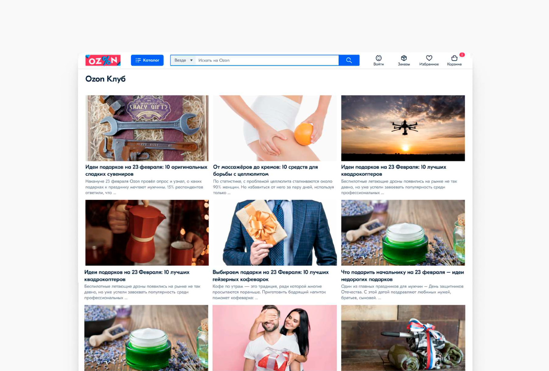
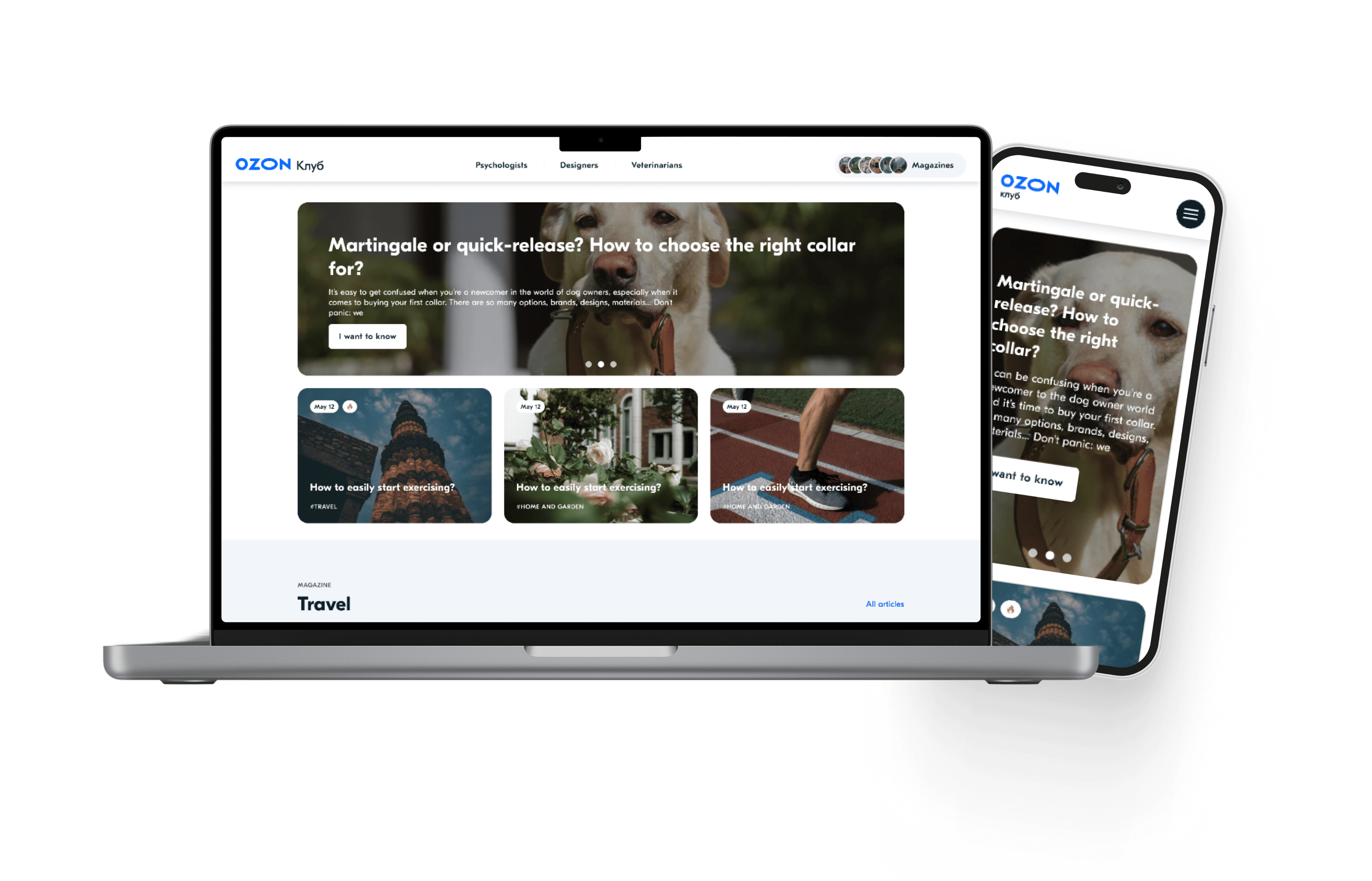
Old blog design.
Our department was tasked with a complete overhaul the Ozon Club user interface by streamlining content to product purchases and developing an admin system for content creators to upload and edit articles. Other issues included:
- Product links felt broken
- Some items did not exist (broken links)
- Outdated website design
- Inflexible page design (photos only allowed at the top, no rich text, etc.)
- Mobile version was broken
- Dark mode was buggy
My role
As the team’s Senior Product designer, my primary focus was on conceptualizing the logic of widgets, ensuring they could easily be combined and swapped. My objective was to develop an intuitive interface to upload articles that was accessible to both managers and editors across all UI layers. Throughout the process, I maintained constant communication with the development team, monitored task division, and obtained project approvals from the lead editor.
Challenges
- Create a visually-intuitive user interface. I reevaluated the logic of articles, contemplating the integration of quotations, product cards, photos, slideshows, text selection, numbering. I also introduced of tables, schedules, and the hierarchy of headings within the article.
- Design an intuitive admin system for creating articles in collaboration with editors. I thoroughly considered the entire process, from login to publishing the final version of an article. Additionally, I created a library of icons to enhance the visual elements of the system.
- The project timeline was limited to approximately three months. This included of the both the design and development phases.
User Research – Article Editing in Admin System
Objective: Understand how editors create and edit articles in the internal admin system and identify areas for UX improvement.
Participants:
Experience: 3–10+ years in editorial content
5 editors (3 in-house, 2 freelance)
Age range: 29–52
Methodology:
1:1 semi-structured interviews (30–45 mins)
Usability test with clickable prototype
Follow-up qualitative survey
Problems Identified:
- Heavy reliance on third-party tools like Google Docs and Grammarly caused fragmented workflows and version control issues
- Lack of real-time preview made it difficult to visualize the final layout
- Manual formatting was time-consuming and inefficient
- Unclear behavior for out-of-stock or outdated product cards created confusion
What the Redesign Solves:
- Enables real-time inline editing with live preview
- Introduces modular formatting components (headings, images, product cards)
- Applies clear fallback styles for unavailable products
- Offers contextual help and smart defaults to simplify the experience
Expected Outcomes:
- Streamlined editorial workflow
- No need for external editing tools
- More confident and productive editors
- Higher adoption rate of the internal system
- Increased article effectiveness and popularity
- Boosted business sales through improved content quality
They're watching us
20 000
Overview materialat least 20,000 unique visitors in 14 days (when announced on social networks)
35 000
Interactive material35,000 unique visitors in 14 days (when announced on social networks)
20 000
independent expertsat least 20,000 unique visitors in 14 days (when announced on social networks)
Discovery
Our research included existing interfaces of direct and indirect competitors. From this, we developed important design rules and guidelines. For example, we observed instances where content blocks extend across a long scroll, leaving considerable empty space due to excessive text. To address this, we implemented limitations on the number of characters allowed in headings and subtexts.
Other discoveries from the analysis:
- Some pages lacked an intuitive option for making a purchase or adding items to the cart.
- Dark mode, which is very popular in Russia, was not being adequately supported. Also, several high-resolution images for retina displays were not rendering properly.
These crucial details became a priority for the project.
Optimizing and Promoting Expert Content
Originally, Ozon Club did not integrate expert content with search optimization. However, it quickly became evident that expert content needed to be complemented with SEO to ensure its long-term effectiveness. To address this, we took a reversed approach: Instead of being demand-driven, our strategy was based on pre-existing articles. Ozon Club already had a plethora of written materials, and the challenge was to determine the feasibility of optimizing these texts for SEO. We began by drafting technical specifications for revision. This helped to avoid issues such as outdated topics, mismatched text volumes, and misalignment between an article and an expert. Overall, approximately half of all articles fit our strategy and were successfully revised. To promote the revised materials, we leveraged internal tools (banners, buttons, etc.) as well as the our experts’ social networks.
Dynamic widget system
Post-Redesign Examples
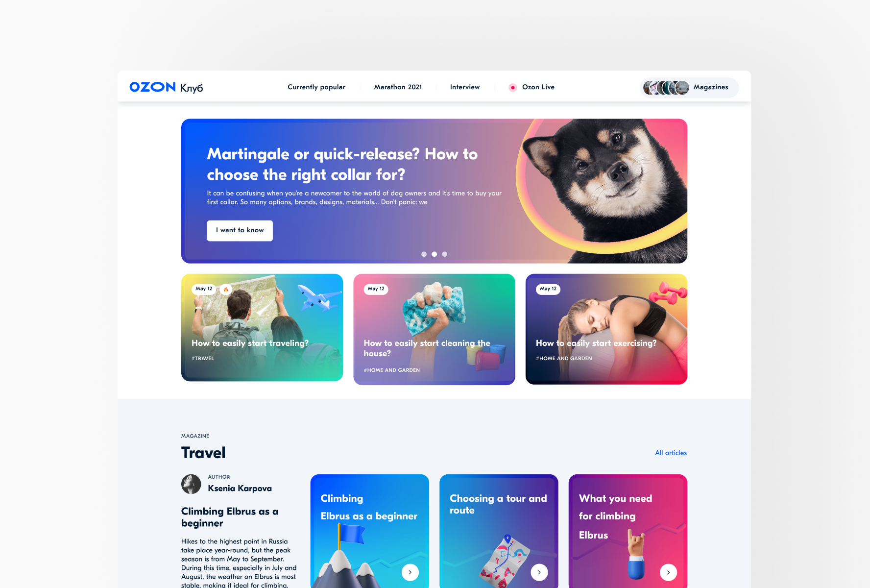
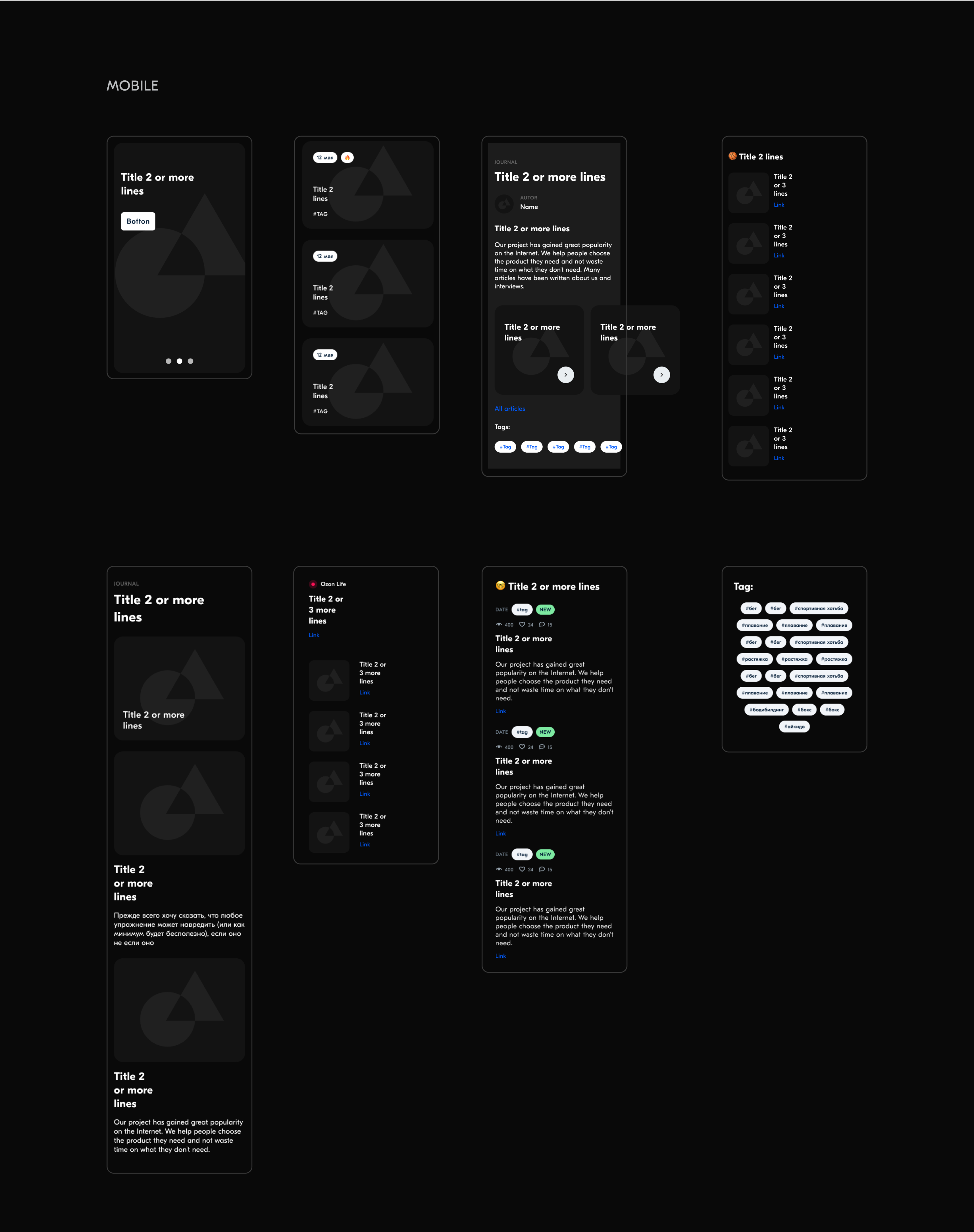
All content blocks were intentionally designed to ensure visual consistency, no matter where they are placed on the page. This allows authors to focus on creating content without worrying about layout decisions. Articles can be arranged in any order, and the page will still look dynamic and engaging. We tested various blocks to see which ones performed best and which drew the most user attention.Carousel with examples of filled blocks for the homepage.
Additional Pages for the Project
Admin system
The core part of this project was developing the admin system. We conducted user research with editors to gather the most popular requests, articles, and widgets. Using our design guidelines and brand styles, we refined and optimized these elements. Maintaining brand consistency—even in projects like this—was crucial. As a result, we boosted sales through articles and business recommendations, and the publication became one of the most-read online magazines after a successful social media promo campaign.
Configuring the Log.
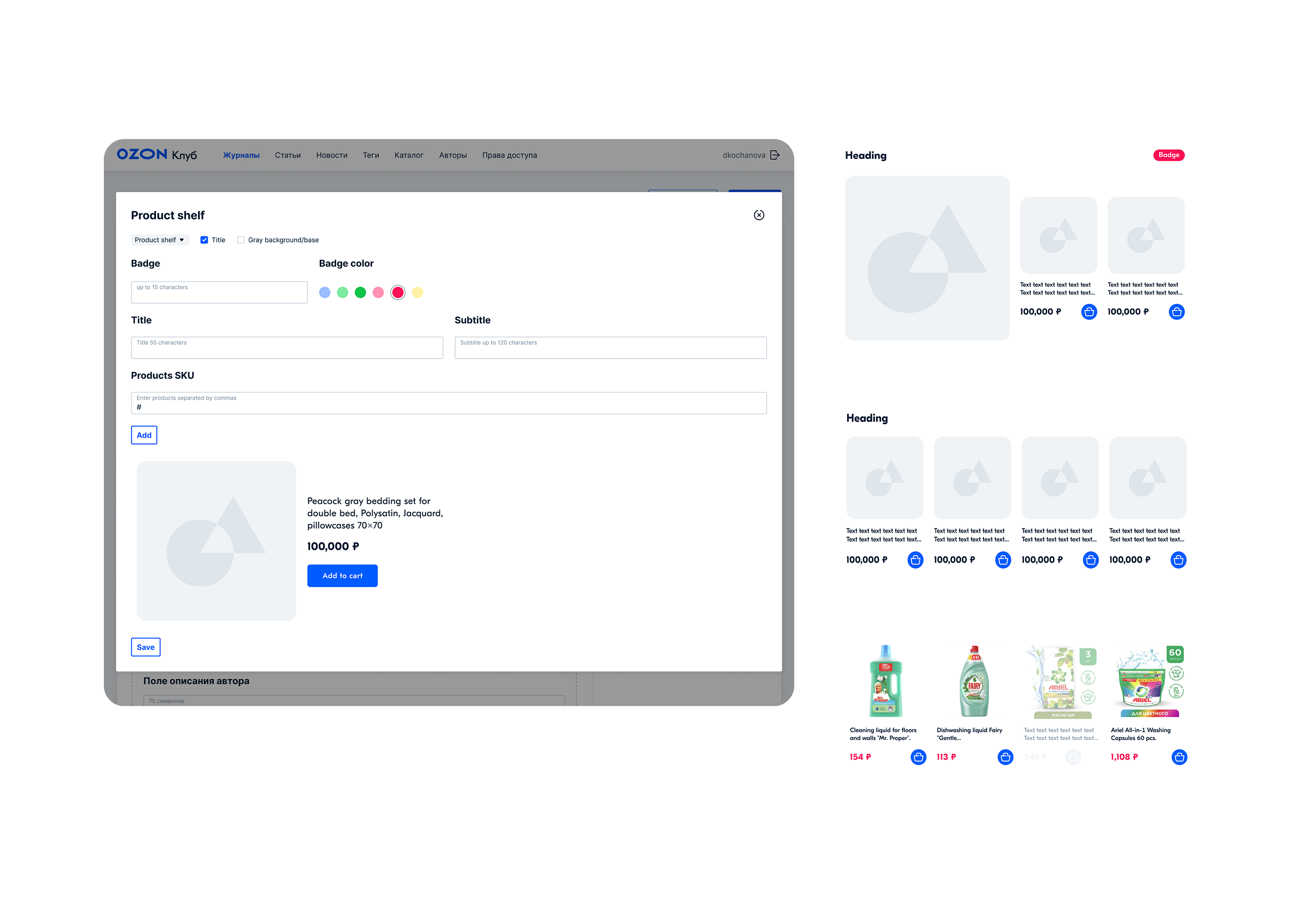
The product shelves are inside the article.
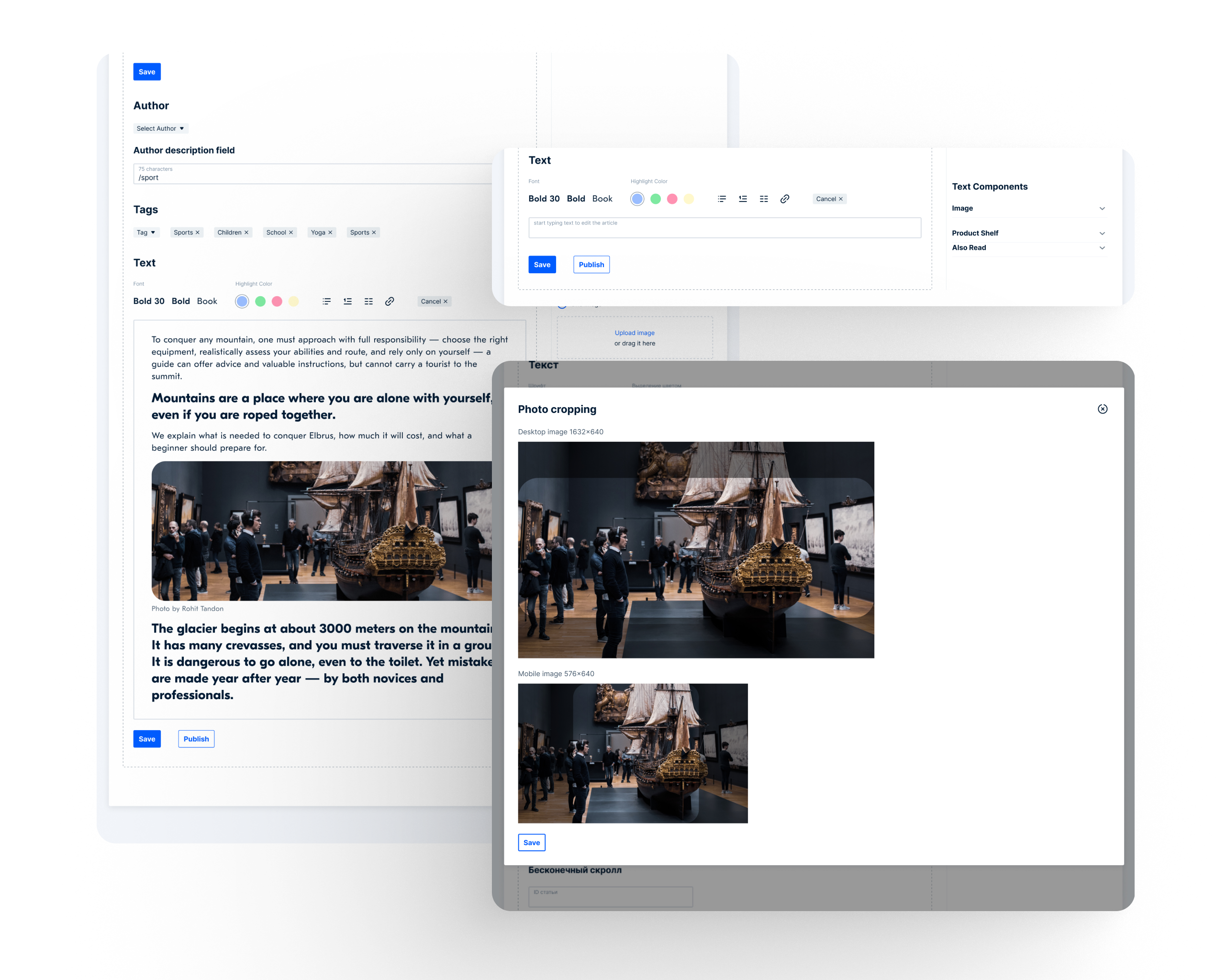
Great opportunities for working with text and inserting photos.
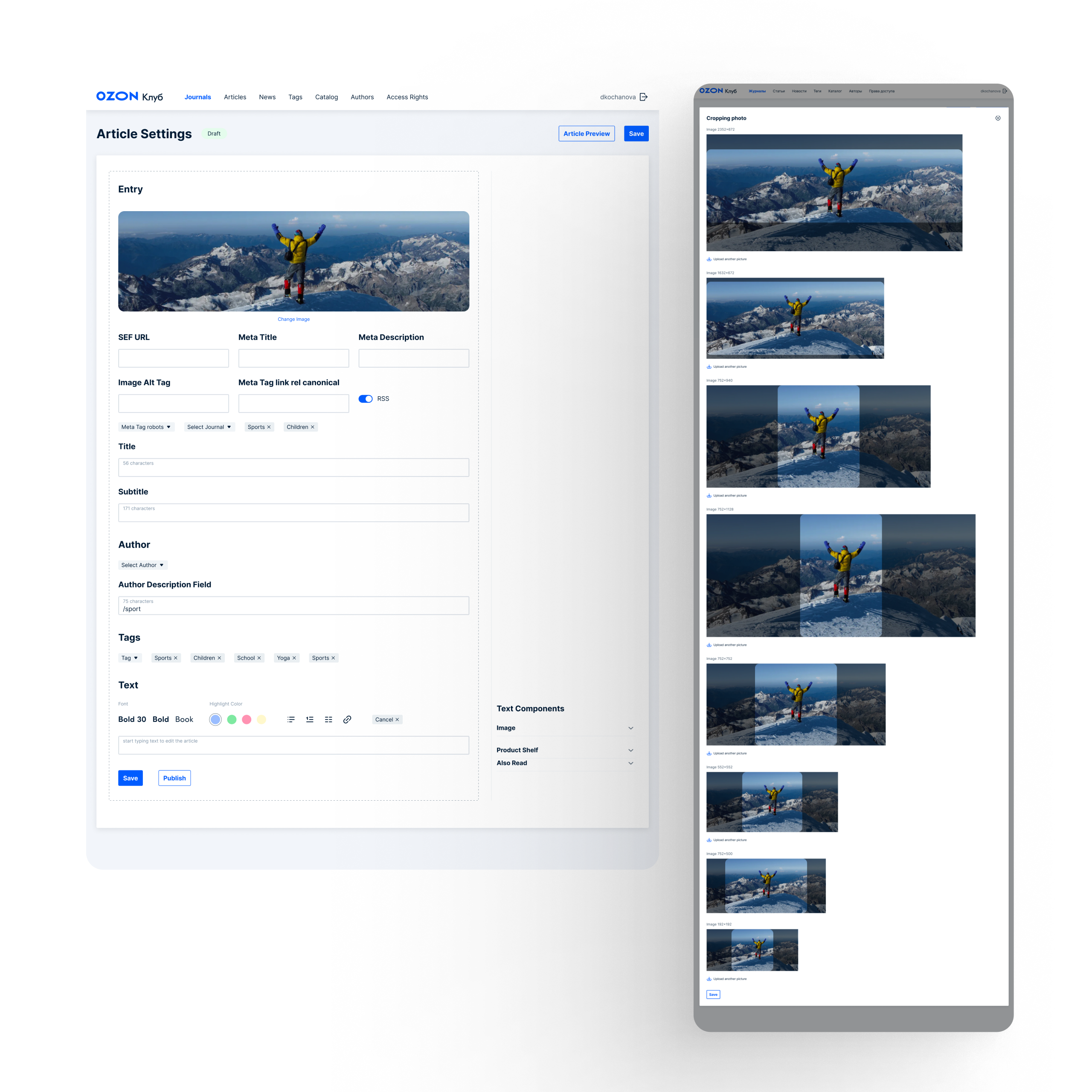
The ability to crop the image to your liking in all displayed formats and for the cover of an article.
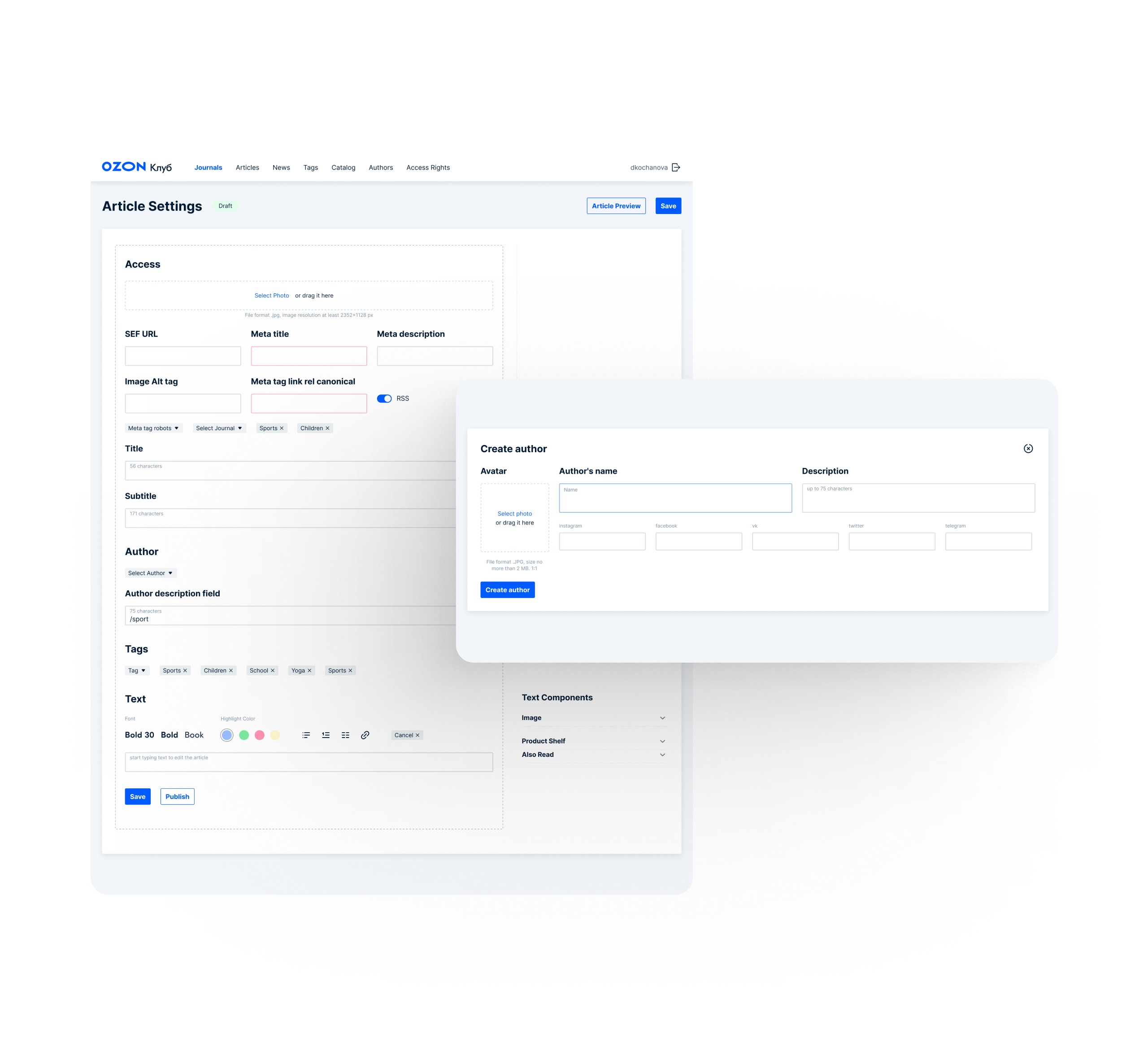
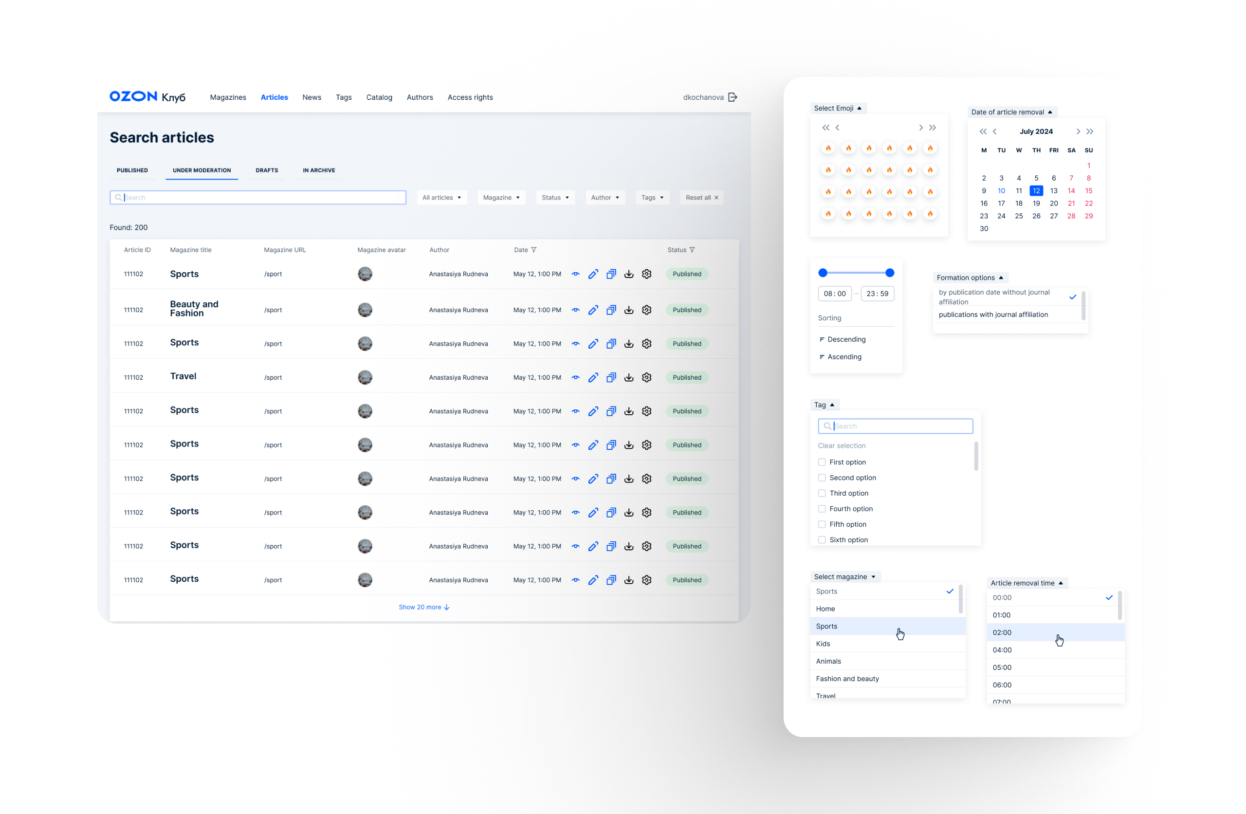
We designed a wide variety of content widgets specifically for article creation. After conducting research, we identified and implemented all essential features — including link attachments, publication counters, and visual continuity between blocks. To support editors, we illustrated how editable blocks would appear in real time, making the system intuitive and easy to use.
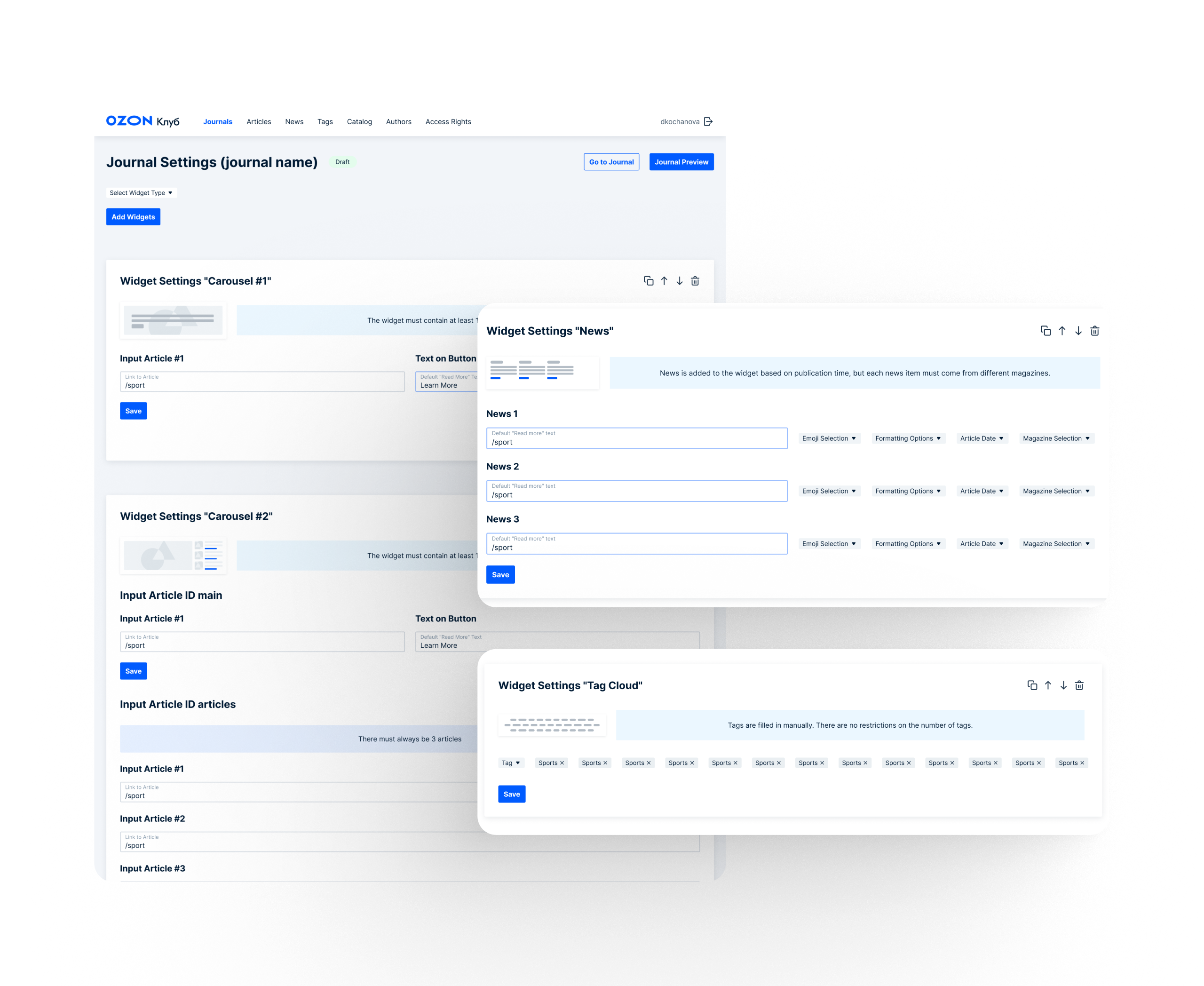
Setting up a log with prepared widgets. Users can select the desired widget and customize it by adding titles, text, and more.
Setting up a log with prepared widgets. Users can select the desired widget and customize it by adding titles, text, and more.
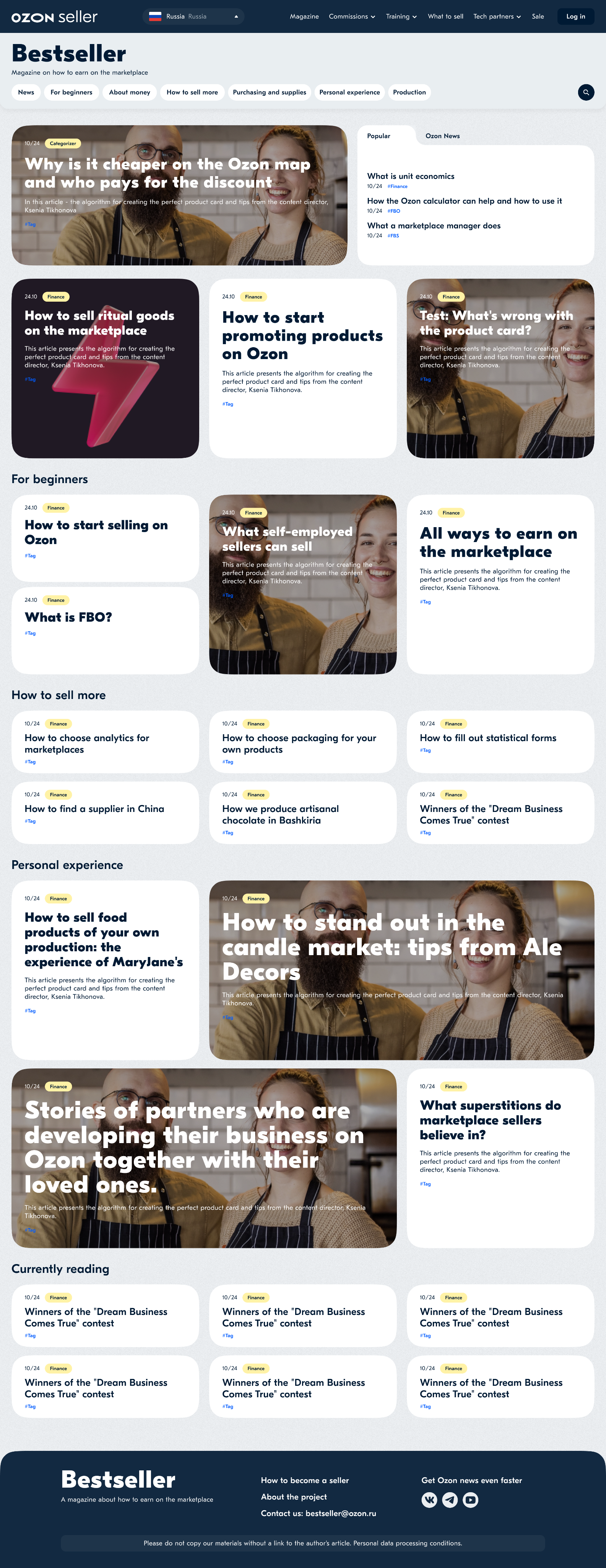
Overall, the admin panel reduced article development time while improving the layout of each page. We solved several issues with font pairing, text colors, and image rounding. Through great communication and coordination, this project was completed very quickly: Design (including editing) was completed in three weeks and development took approximately two months. Finally, by leveraging my experience from this project, I created an additional platform to help train sellers on how to work with our marketplaces: BestSeller Project
Key Learnings
This project gave me deep insight into how content impacts user engagement. I learned what types of article structures and information attract attention, and how to seamlessly integrate product cards in a non-intrusive way. We explored edge cases — like handling out-of-stock products or redesigning legacy articles — and ensured they looked intentional rather than broken. I also learned how to create flexible design solutions that support both current and outdated content without introducing visual or UX issues. Through hands-on research and testing with real editors, we validated how articles could be easily created and edited directly in our internal admin system — without relying on third-party tools.
Credits
Olga Kusterer
I built the admin system as a Senior Product Designer for creating and editing articles, as well as for managing the writer’s personal dashboard. I also developed the visual style of the platform, designed components and blocks, and defined all style guidelines as a Visual Designer.
Valeriya Bulycheva
Head of Content – Valeria is an expert in building tools like this. Together, we conducted research with article authors, ran A/B tests, and created all the prototypes ourselves.
Olga Kusterer
Main page
→
Resume
→
Ozon Club content platform
Ozon Club is a content platform with the mission of helping customers make more informed decisions. Its goal is to enable customers to gain a deeper understanding of brands and products on a single, comprehensive site with trustworthy content created by subject-matter experts. Prior to this project, content was scattered throughout several places, complicating a user’s experience and potentially hindering them from finding credible information. These are the gaps that Ozon Club aims to fill.
Ozon offers millions of products from hundreds of thousands of sellers. Ozon Club is the platform’s content site, targeting consumers across a wide variety of goods and services. Content is created by Ozon-verified experts and includes things like product/service selection, usage, price navigation, and reviews.
Increased Website Traffic by 30% and Boosted Sales!
Project Objective
Old blog design.
Our department was tasked with a complete overhaul the Ozon Club user interface by streamlining content to product purchases and developing an admin system for content creators to upload and edit articles. Other issues included:
- Product links felt broken
- Some items did not exist (broken links)
- Outdated website design
- Inflexible page design (photos only allowed at the top, no rich text, etc.)
- Mobile version was broken
- Dark mode was buggy
My role
As the team’s Senior Product designer, my primary focus was on conceptualizing the logic of widgets, ensuring they could easily be combined and swapped. My objective was to develop an intuitive interface to upload articles that was accessible to both managers and editors across all UI layers. Throughout the process, I maintained constant communication with the development team, monitored task division, and obtained project approvals from the lead editor.
Challenges
- Create a visually-intuitive user interface. I reevaluated the logic of articles, contemplating the integration of quotations, product cards, photos, slideshows, text selection, numbering. I also introduced of tables, schedules, and the hierarchy of headings within the article.
- Design an intuitive admin system for creating articles in collaboration with editors. I thoroughly considered the entire process, from login to publishing the final version of an article. Additionally, I created a library of icons to enhance the visual elements of the system.
- The project timeline was limited to approximately three months. This included of the both the design and development phases.
User Research – Article Editing in Admin System
Objective: Understand how editors create and edit articles in the internal admin system and identify areas for UX improvement.
Participants:
Experience: 3–10+ years in editorial content
5 editors (3 in-house, 2 freelance)
Age range: 29–52
Methodology:
1:1 semi-structured interviews (30–45 mins)
Usability test with clickable prototype
Follow-up qualitative survey
Problems Identified:
- Heavy reliance on third-party tools like Google Docs and Grammarly caused fragmented workflows and version control issues
- Lack of real-time preview made it difficult to visualize the final layout
- Manual formatting was time-consuming and inefficient
- Unclear behavior for out-of-stock or outdated product cards created confusion
What the Redesign Solves:
- Enables real-time inline editing with live preview
- Introduces modular formatting components (headings, images, product cards)
- Applies clear fallback styles for unavailable products
- Offers contextual help and smart defaults to simplify the experience
Expected Outcomes:
- Streamlined editorial workflow
- No need for external editing tools
- More confident and productive editors
- Higher adoption rate of the internal system
- Increased article effectiveness and popularity
- Boosted business sales through improved content quality
They're watching us
20 000
Overview materialat least 20,000 unique visitors in 14 days (when announced on social networks)
35 000
Interactive material35,000 unique visitors in 14 days (when announced on social networks)
20 000
independent expertsat least 20,000 unique visitors in 14 days (when announced on social networks)
Discovery
Our research included existing interfaces of direct and indirect competitors. From this, we developed important design rules and guidelines. For example, we observed instances where content blocks extend across a long scroll, leaving considerable empty space due to excessive text. To address this, we implemented limitations on the number of characters allowed in headings and subtexts.
Other discoveries from the analysis:
- Some pages lacked an intuitive option for making a purchase or adding items to the cart.
- Dark mode, which is very popular in Russia, was not being adequately supported. Also, several high-resolution images for retina displays were not rendering properly.
These crucial details became a priority for the project.
Optimizing and Promoting Expert Content
Originally, Ozon Club did not integrate expert content with search optimization. However, it quickly became evident that expert content needed to be complemented with SEO to ensure its long-term effectiveness. To address this, we took a reversed approach: Instead of being demand-driven, our strategy was based on pre-existing articles. Ozon Club already had a plethora of written materials, and the challenge was to determine the feasibility of optimizing these texts for SEO. We began by drafting technical specifications for revision. This helped to avoid issues such as outdated topics, mismatched text volumes, and misalignment between an article and an expert. Overall, approximately half of all articles fit our strategy and were successfully revised. To promote the revised materials, we leveraged internal tools (banners, buttons, etc.) as well as the our experts’ social networks.
Dynamic widget system
Post-Redesign Examples
All content blocks were intentionally designed to ensure visual consistency, no matter where they are placed on the page. This allows authors to focus on creating content without worrying about layout decisions. Articles can be arranged in any order, and the page will still look dynamic and engaging. We tested various blocks to see which ones performed best and which drew the most user attention.Carousel with examples of filled blocks for the homepage.
Additional Pages for the Project
Admin system
The core part of this project was developing the admin system. We conducted user research with editors to gather the most popular requests, articles, and widgets. Using our design guidelines and brand styles, we refined and optimized these elements. Maintaining brand consistency—even in projects like this—was crucial. As a result, we boosted sales through articles and business recommendations, and the publication became one of the most-read online magazines after a successful social media promo campaign.
Configuring the Log.
The product shelves are inside the article.
Great opportunities for working with text and inserting photos.
The ability to crop the image to your liking in all displayed formats and for the cover of an article.
We designed a wide variety of content widgets specifically for article creation. After conducting research, we identified and implemented all essential features — including link attachments, publication counters, and visual continuity between blocks. To support editors, we illustrated how editable blocks would appear in real time, making the system intuitive and easy to use.
Setting up a log with prepared widgets. Users can select the desired widget and customize it by adding titles, text, and more.
Setting up a log with prepared widgets. Users can select the desired widget and customize it by adding titles, text, and more.
Overall, the admin panel reduced article development time while improving the layout of each page. We solved several issues with font pairing, text colors, and image rounding. Through great communication and coordination, this project was completed very quickly: Design (including editing) was completed in three weeks and development took approximately two months. Finally, by leveraging my experience from this project, I created an additional platform to help train sellers on how to work with our marketplaces: BestSeller Project
Key Learnings
This project gave me deep insight into how content impacts user engagement. I learned what types of article structures and information attract attention, and how to seamlessly integrate product cards in a non-intrusive way. We explored edge cases — like handling out-of-stock products or redesigning legacy articles — and ensured they looked intentional rather than broken. I also learned how to create flexible design solutions that support both current and outdated content without introducing visual or UX issues. Through hands-on research and testing with real editors, we validated how articles could be easily created and edited directly in our internal admin system — without relying on third-party tools.
Credits
Olga Kusterer
I built the admin system as a Senior Product Designer for creating and editing articles, as well as for managing the writer’s personal dashboard. I also developed the visual style of the platform, designed components and blocks, and defined all style guidelines as a Visual Designer.
Valeriya Bulycheva
Head of Content – Valeria is an expert in building tools like this. Together, we conducted research with article authors, ran A/B tests, and created all the prototypes ourselves.