Olga Kusterer
Main page
→
Resume
→
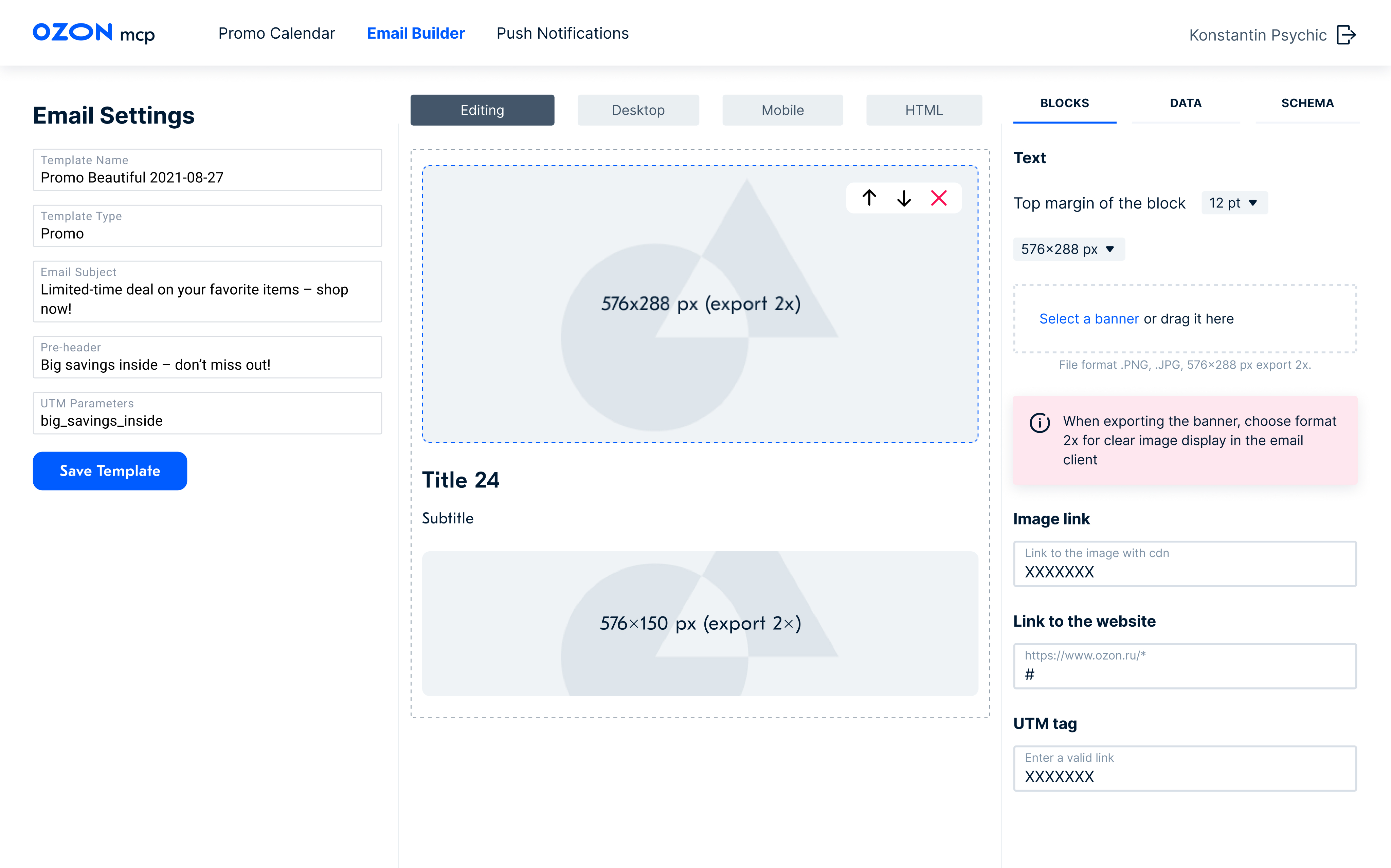
Email builder
The admin system for creating and sending all types of emails reduced business expenses by eliminating the need for subscriptions to third-party email services.
Email marketing was a key sales channel for Ozon, but design inconsistencies across teams hurt the brand. I developed a unified tool to standardize email templates—fonts, colors, formatting, and logos—replacing multiple third-party services. This was part of our global rebranding initiative.
Creating an Email Now Takes 15 Minutes Instead of 2 Weeks!
Project Objective
As we began our global rebranding, we saw an urgent need to improve customer emails. With 14 product categories managed by different teams, users were receiving too many emails, too often. Each team used its own third-party tools, making analytics and quality control difficult.
Designers and developers also had to build each email manually, wasting time on repetitive layout work. Some managers added custom signatures or festive designs, often straying from brand guidelines.
My Role
I was tasked with redesigning our email layouts and developing an intuitive email builder. This involved the following steps:
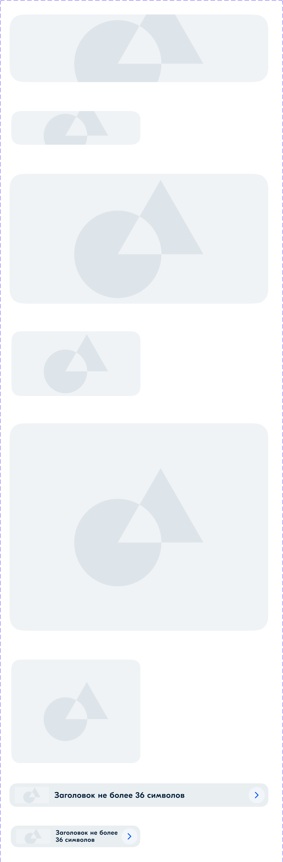
- Creating a master library containing blocks, font pairs, buttons, and letter structure templates.
- Designing and testing email headers, bodies, and footers, including iterative adjustments to ensure a style consistent with our branding principles.
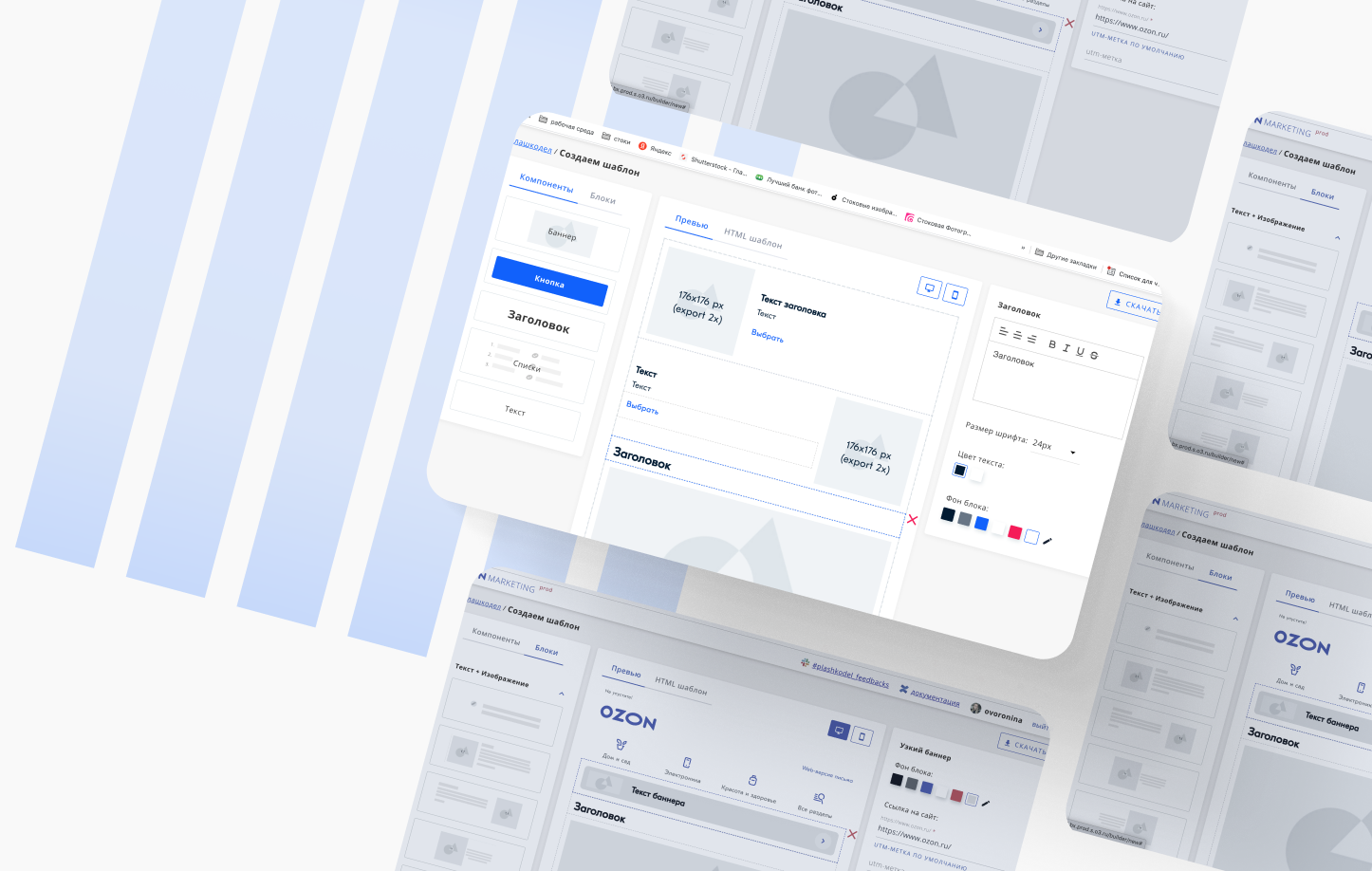
- Developing the email builder, which templates the majority of the email creation process.
- Providing training sessions on how to use the new tool, as well as to better understand our brand principles.
Challenges
- Inconsistent Design: Colors, buttons, typography, and tone varied across emails — creating a fragmented brand experience.
- Decentralized Workflow: 14 departments handled emails independently, resulting in disjointed communication that didn’t feel like one company.
- Slow Production: Email creation took up to two weeks from concept to send.
- Missing Features: No support for dark mode or SVGs — both critical for modern email standards and user expectations.
📬 Main Email Categories in Ozon
I began by meeting with team leads to map out all email types used across the company. Then, I worked with the research team to analyze which content blocks performed best and which emails drove measurable results. I also reviewed user feedback from social media and email-specific comments. To coordinate the process, I created detailed Jira tasks with clear step-by-step instructions and added all stakeholders as watchers.
14 different departments were sending emails. We needed to make them all consistent. I met several times with different development leads to discuss the creation of the admin system and successfully pushed the task into the top priority projects needed by the business.
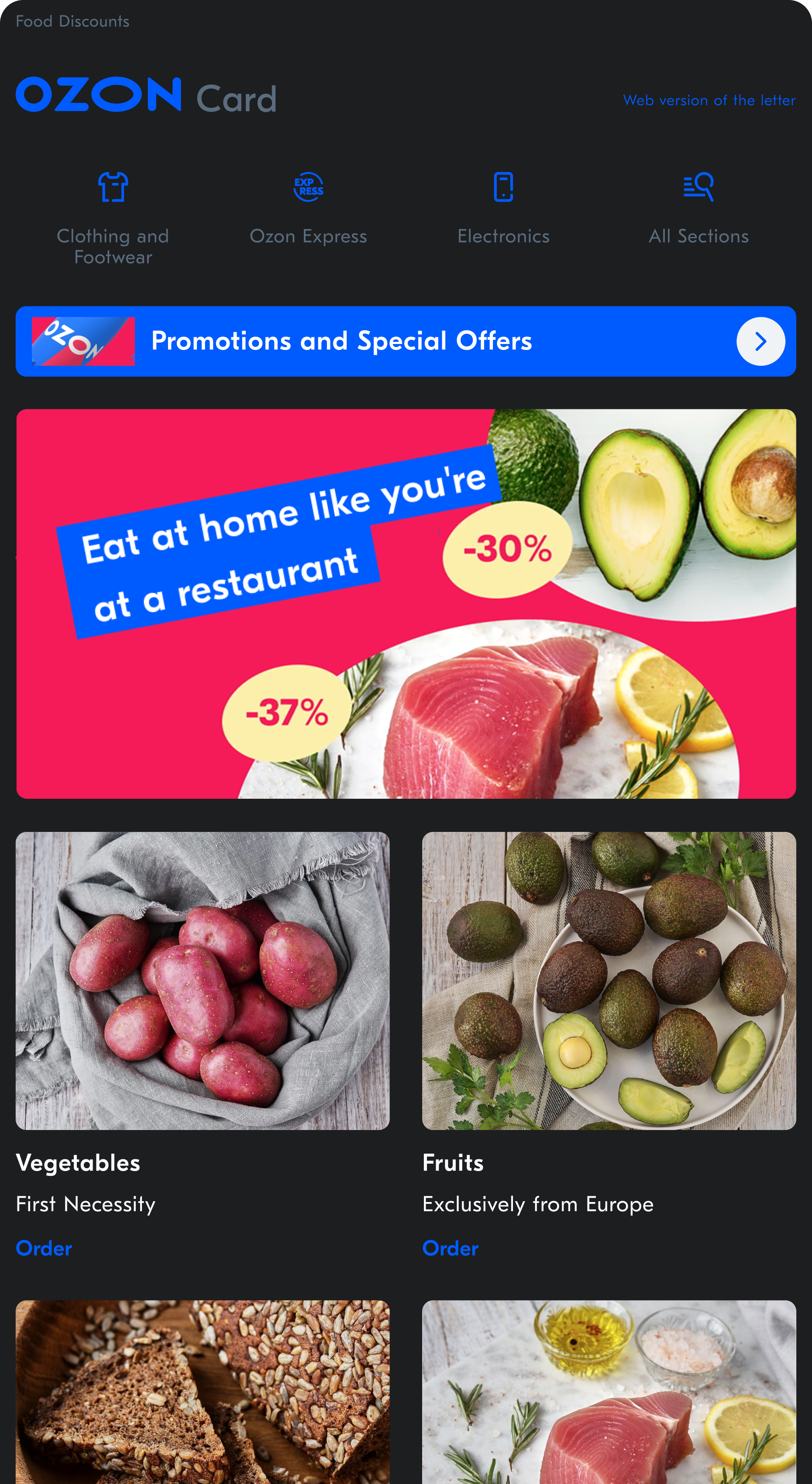
The final email designs.
Then, I made a single design ( UI Kit )
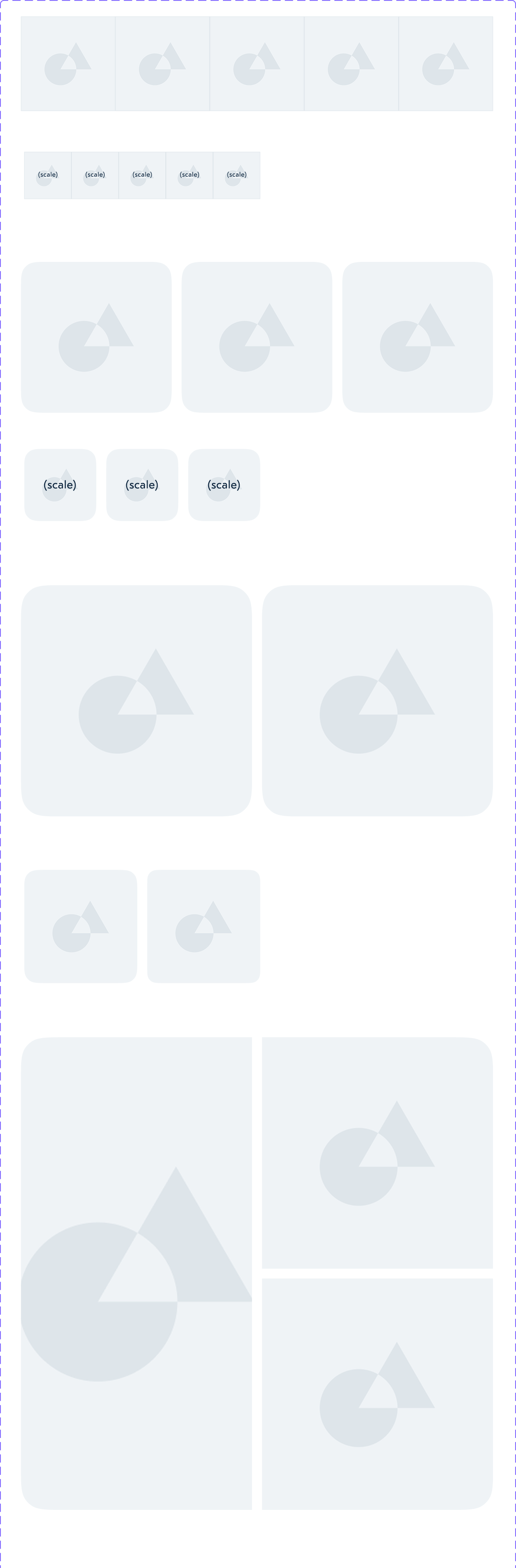
Sample of promotional components.
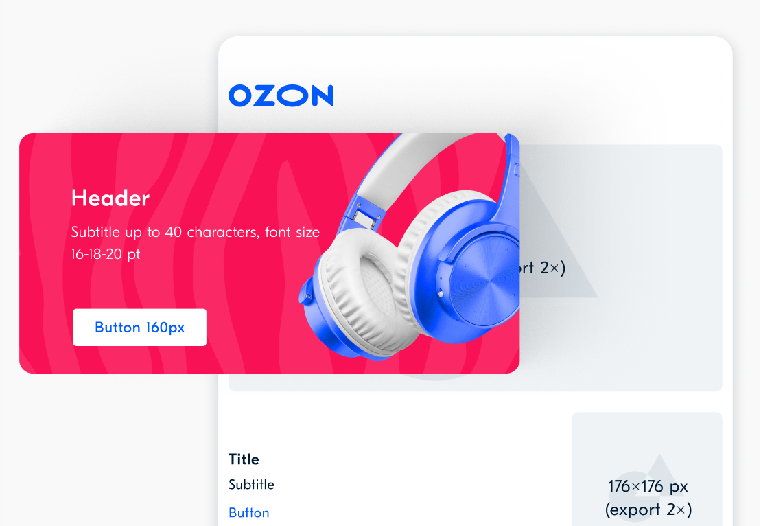
To unify our email marketing, I created an integrated style guide covering colors, headers, buttons, logos, and fonts. I also defined the placement of banners, collages, promo codes, and other visual elements. Each content block was designed with precise dimensions to ensure clean alignment. I carefully selected font pairings to make the content easy to scan and highlight the most important information in each email.
Left: A standard email about an order that does not take considerable development time. Right: A creative email that may take up to two weeks to design, develop, and launch.
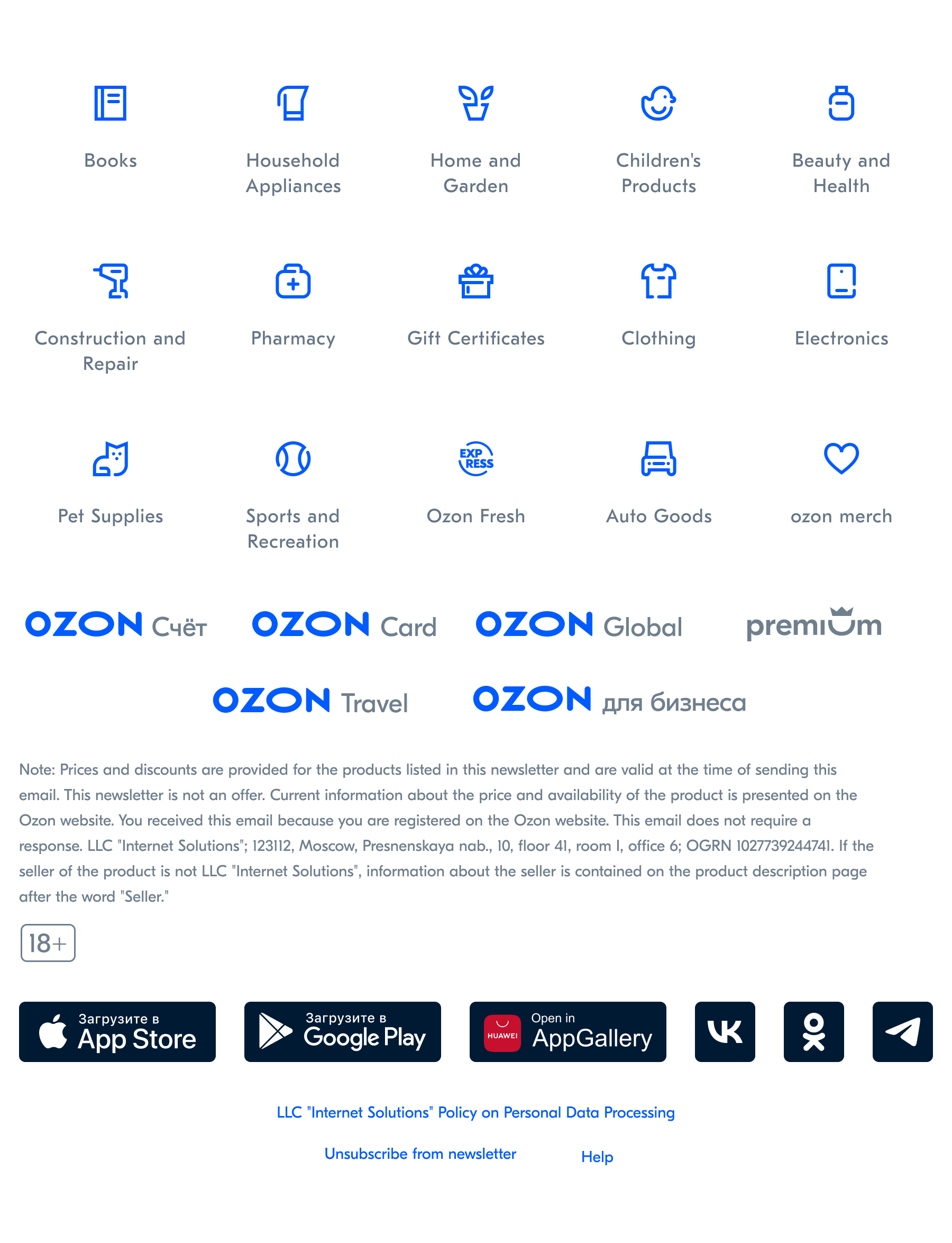
Logos of Company Divisions
Logos can easily be selected from the UI Kit library in Figma, as well as in the admin system. Each product has a single design, along with a special gray color version for dark mode.
Icons
We A/B tested icons v. text, implementing an icon-based design based on the results. Our continual testing efforts led to the pioneering of a dynamic system where icons change based on a user's interests and order history.
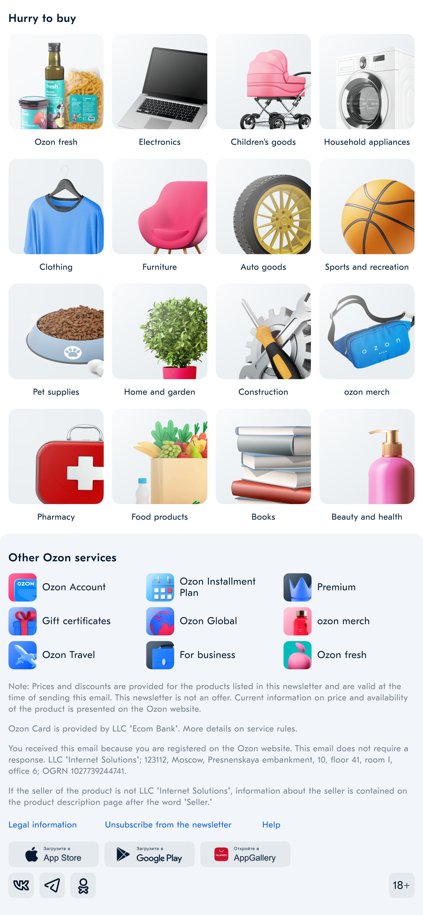
Example of dynamic icons in an email header.
Dark Mode
To support dark mode, we replaced all icons and logos with SVG. We also informed designers that components need to be saved in 2x format so that they do not get blurred on a retina display.
Training and Implementation
Over three months, I trained designers from all departments on using standardized fonts, spacing, and components. I showcased how existing emails could be recreated with templates. This unified system reduced production time from two weeks to two days and significantly improved brand consistency.
We also reached an analytical milestone by visualizing the full email queue, which later helped us optimize frequency and avoid over-emailing users.
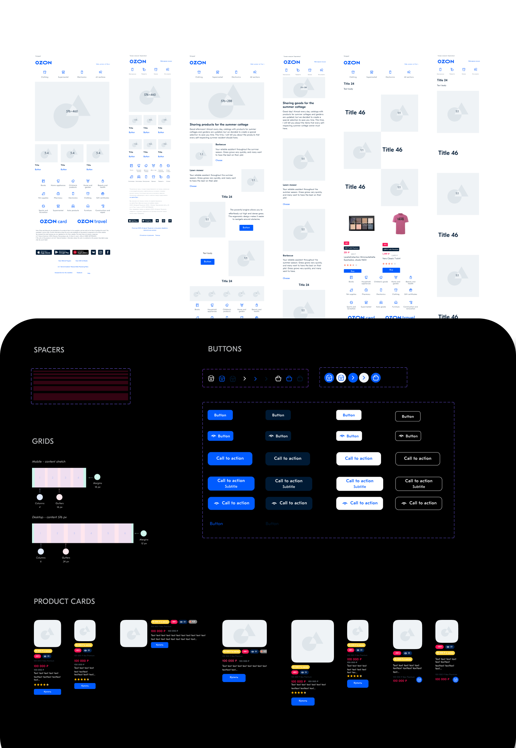
A fragment of the UI Kit and an example of the email.
Footer or a place in the sun
Through A/B testing, we discovered that a significant number of clicks occur in the footer of the email, specifically on the icons. We tested and selected stylish 3D icons to replace the old 2D versions. Each icon has its own unique style while remaining consistent with the overall brand.
Example: How to Easily Build an Email — Even for a New Delivery Category
The Ozon Fresh branding fit seamlessly into all the blocks, showing that everything was thoughtfully designed down to the smallest detail.
We set this goal ourselves. We planned to build a banner builder but aimed higher. After users and teams interviews, we broke the task into smaller parts and started creating blocks. It wasn’t easy.
This project changed my perspective and sharpened my design eye. Now, if a logo isn’t in SVG or PNG, fonts are misaligned, or dark mode isn’t considered — I see it as a reflection of the company’s maturity. Gathering extensive user feedback taught me a lot.Spending a summer teaching and consulting with managers brought me closer to my company — we truly became one big team.
The email builder saved us time and money
The idea for the email builder emerged while we were testing blocks. Developers were tired of coding inconsistent “creative” emails, and many lacked a unified style or tone. We created a voice guide, trained the team, and after launch, replaced all third-party tools with our own. It was a big and exciting shift.
✅ Done
- The graphic designer only created visuals to drop into the containers — the email itself was built by the manager, and all banner sizes were already defined in the email UI kit.
- The manager could log into the admin system, set up the email queue, and choose the type of email — all on her own.
- No improvising — everyone follows our guidelines, and new blocks are only added after thorough testing and careful selection.
- No developers needed — we built everything, and it all runs on its own.
Ozon, one of the largest marketplaces in Europe, serves over 32 million customers each month and processes more than 2 million orders per day. This means that over 60 million orders go through the platform monthly, which implies that Ozon sends around 60 million emails per month related to orders alone.
Key Learnings
The email project made me well-known within the company. Whenever something involved emails, people would say, “Ask Olga from Brand.”
This project taught me how to communicate across cross-functional teams and connect people from different departments. I even created a training course on how to build effective emails, wrote an article based on our research, and presented the results at tech conferences.
I developed hypotheses and validated them through testing with real users. The project is still evolving and growing, but I’m proud that my name will be remembered in the company’s history as the creator of this tool.
Credits
Olga Kusterer
I led the project as a Product Designer, and later as a Senior Product Designer.
Philipp Shprints
Lead Copywriter who Created Copywriting and User Communication Guidelines.
Tatyana Delyagina
Worked on the illustrations and also developed the iconography guidelines.
Tatyana Delyagina
Head of the development team who contributed to the creation of the email builder.
Alexander Alekseev
Brand Design – Banner Guidelines.
Maria Ananina
Project Manager and Team Lead.
Olga Kusterer
Contact
Olga Kusterer
Main page
→
Resume
→
Email builder
The admin system for creating and sending all types of emails reduced business expenses by eliminating the need for subscriptions to third-party email services.
Email marketing was a key sales channel for Ozon, but design inconsistencies across teams hurt the brand. I developed a unified tool to standardize email templates—fonts, colors, formatting, and logos—replacing multiple third-party services. This was part of our global rebranding initiative.
Creating an Email Now Takes 15 Minutes Instead of 2 Weeks!
Project Objective
As we began our global rebranding, we saw an urgent need to improve customer emails. With 14 product categories managed by different teams, users were receiving too many emails, too often. Each team used its own third-party tools, making analytics and quality control difficult.
Designers and developers also had to build each email manually, wasting time on repetitive layout work. Some managers added custom signatures or festive designs, often straying from brand guidelines.
My Role
I was tasked with redesigning our email layouts and developing an intuitive email builder. This involved the following steps:
- Creating a master library containing blocks, font pairs, buttons, and letter structure templates.
- Designing and testing email headers, bodies, and footers, including iterative adjustments to ensure a style consistent with our branding principles.
- Developing the email builder, which templates the majority of the email creation process.
- Providing training sessions on how to use the new tool, as well as to better understand our brand principles.
Challenges
- Inconsistent Design: Colors, buttons, typography, and tone varied across emails — creating a fragmented brand experience.
- Decentralized Workflow: 14 departments handled emails independently, resulting in disjointed communication that didn’t feel like one company.
- Slow Production: Email creation took up to two weeks from concept to send.
- Missing Features: No support for dark mode or SVGs — both critical for modern email standards and user expectations.
📬 Main Email Categories in Ozon
I began by meeting with team leads to map out all email types used across the company. Then, I worked with the research team to analyze which content blocks performed best and which emails drove measurable results. I also reviewed user feedback from social media and email-specific comments. To coordinate the process, I created detailed Jira tasks with clear step-by-step instructions and added all stakeholders as watchers.
14 different departments were sending emails. We needed to make them all consistent. I met several times with different development leads to discuss the creation of the admin system and successfully pushed the task into the top priority projects needed by the business.
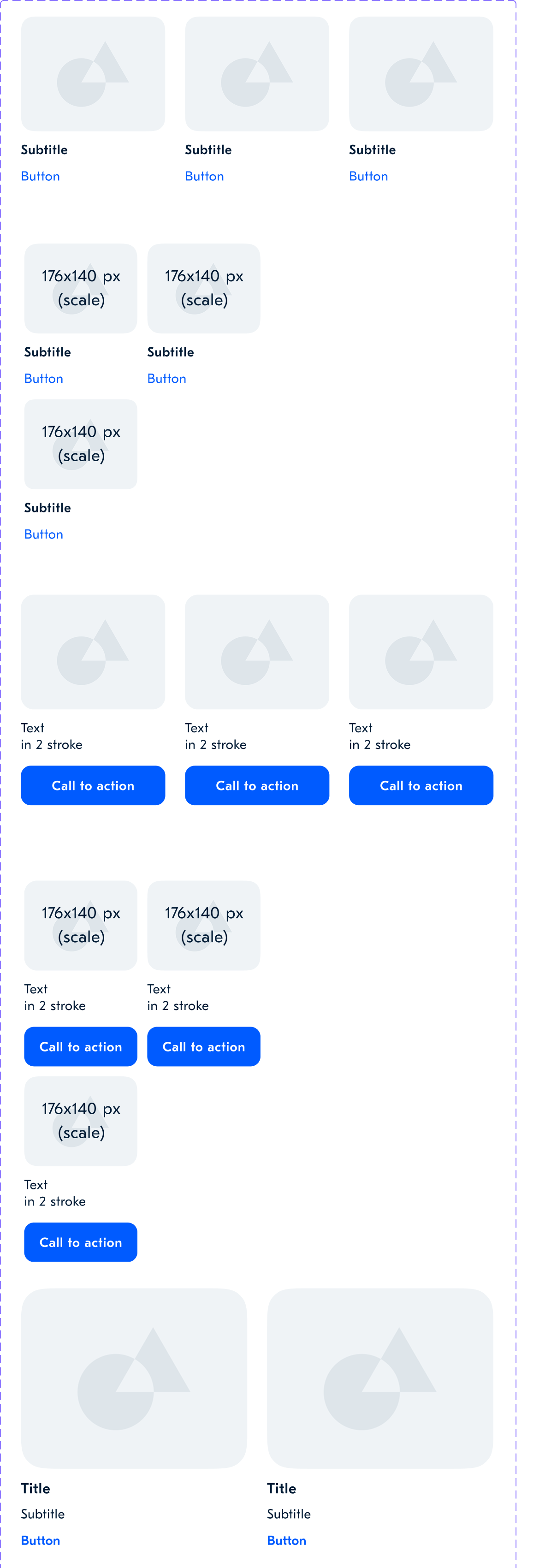
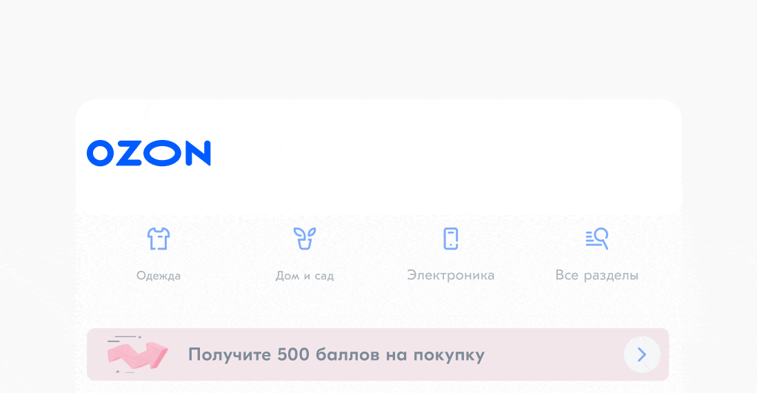
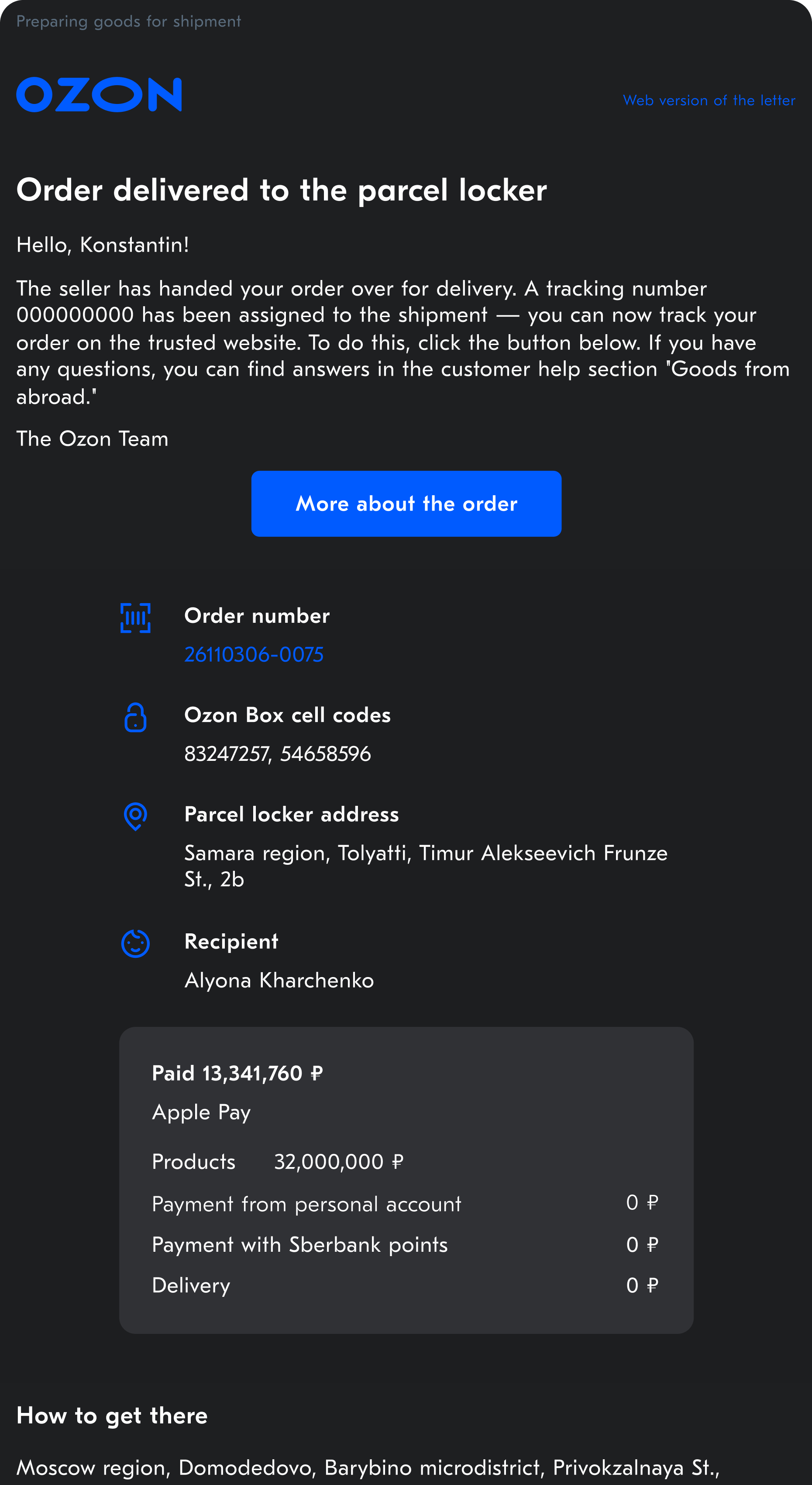
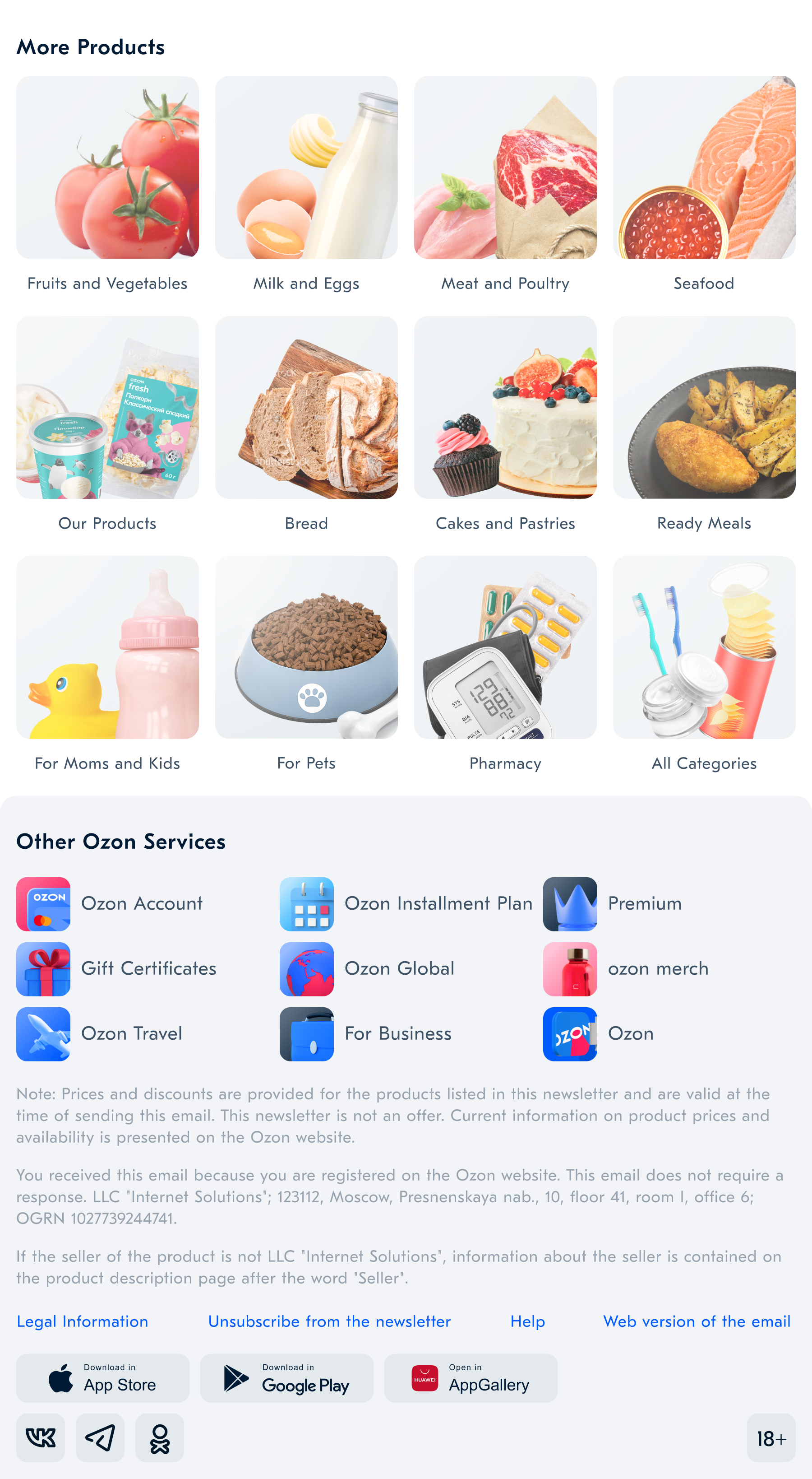
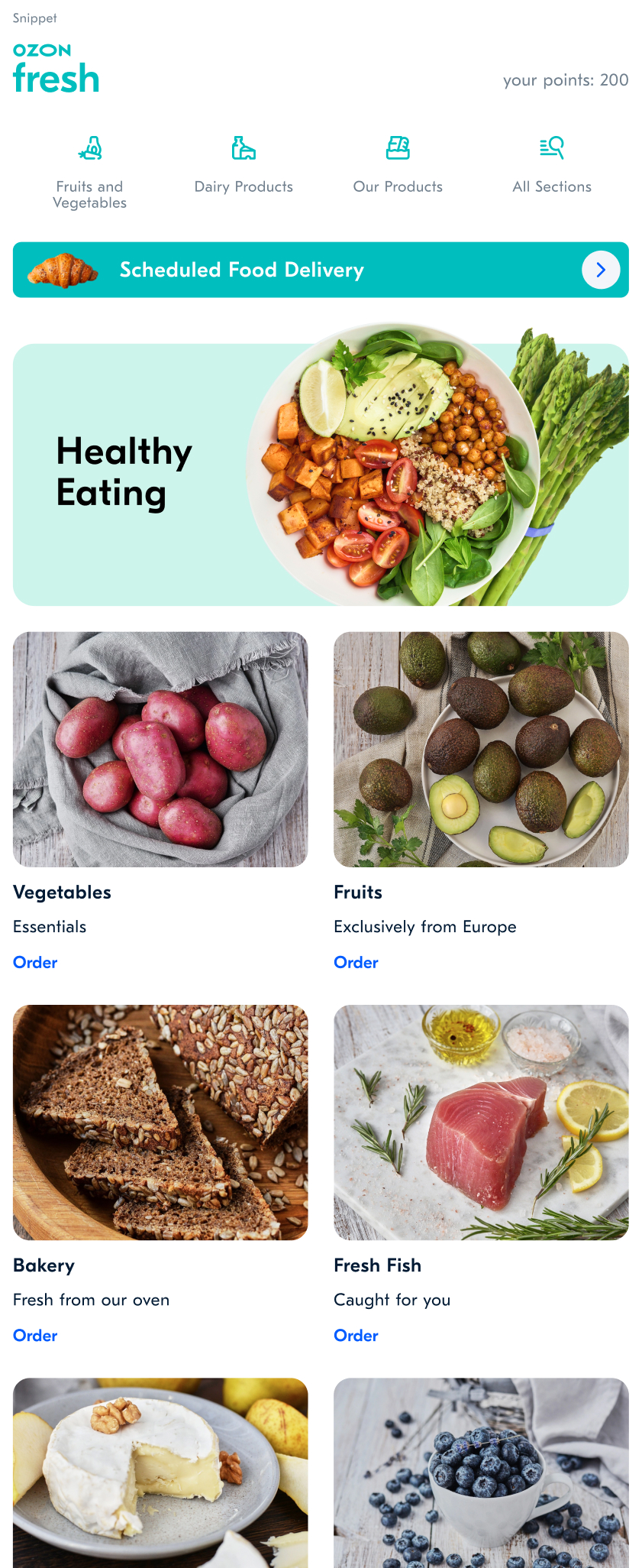
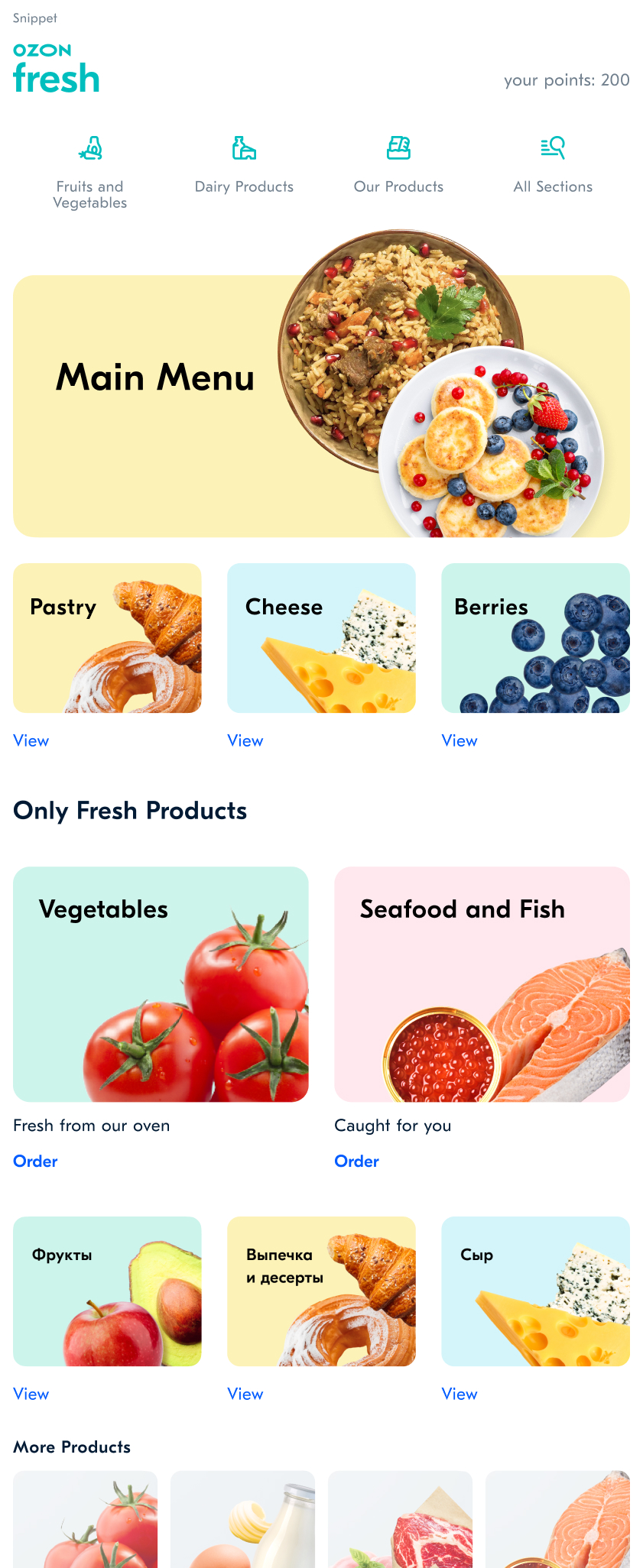
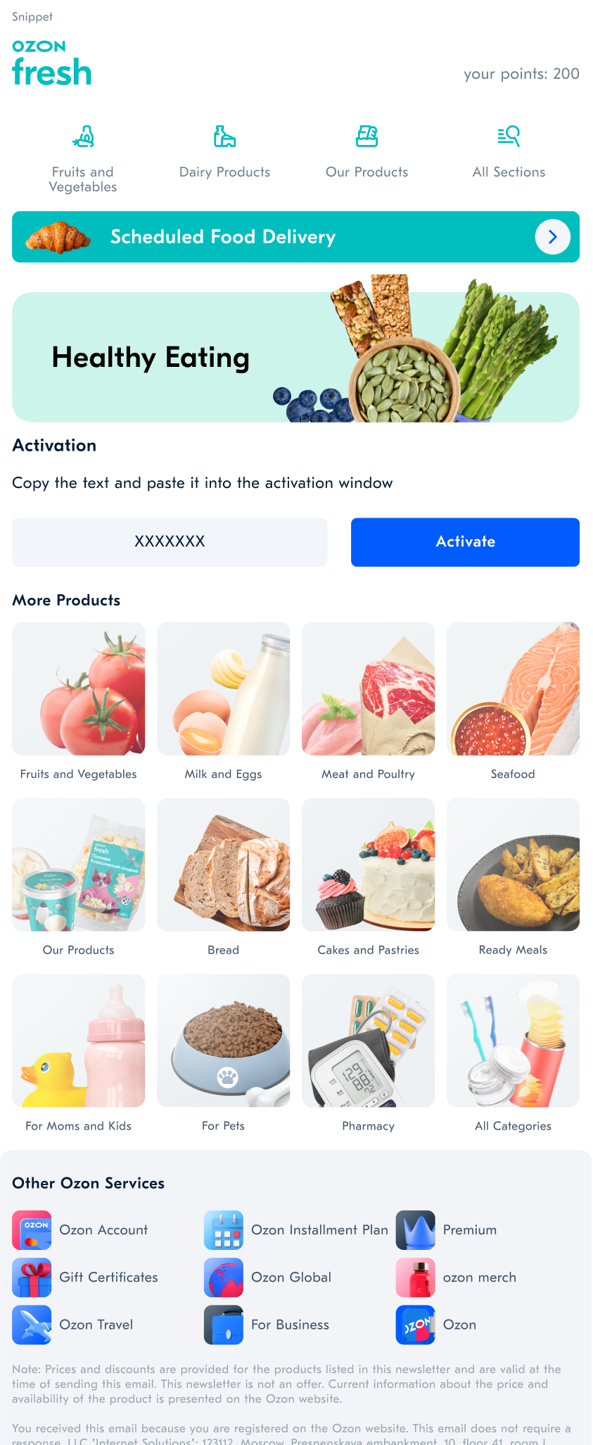
The final email designs.
Then, I made a single design ( UI Kit )
Sample of promotional components.
To unify our email marketing, I created an integrated style guide covering colors, headers, buttons, logos, and fonts. I also defined the placement of banners, collages, promo codes, and other visual elements. Each content block was designed with precise dimensions to ensure clean alignment. I carefully selected font pairings to make the content easy to scan and highlight the most important information in each email.
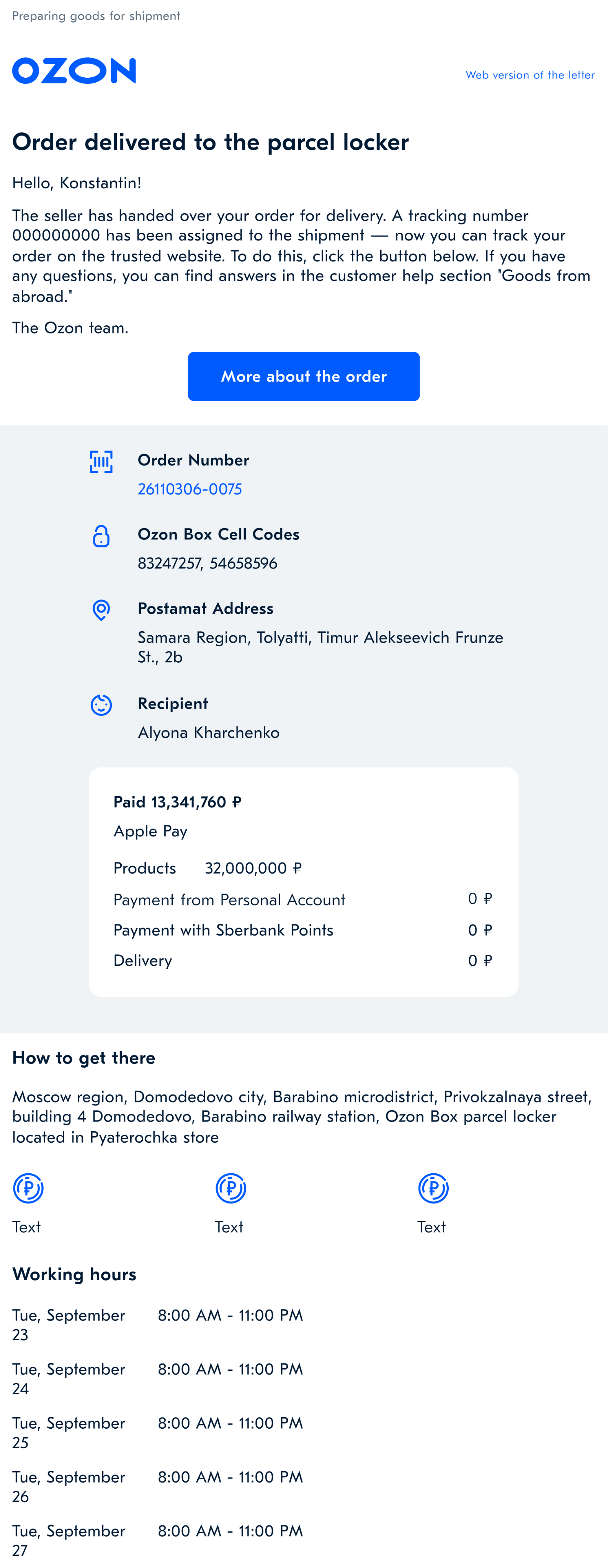
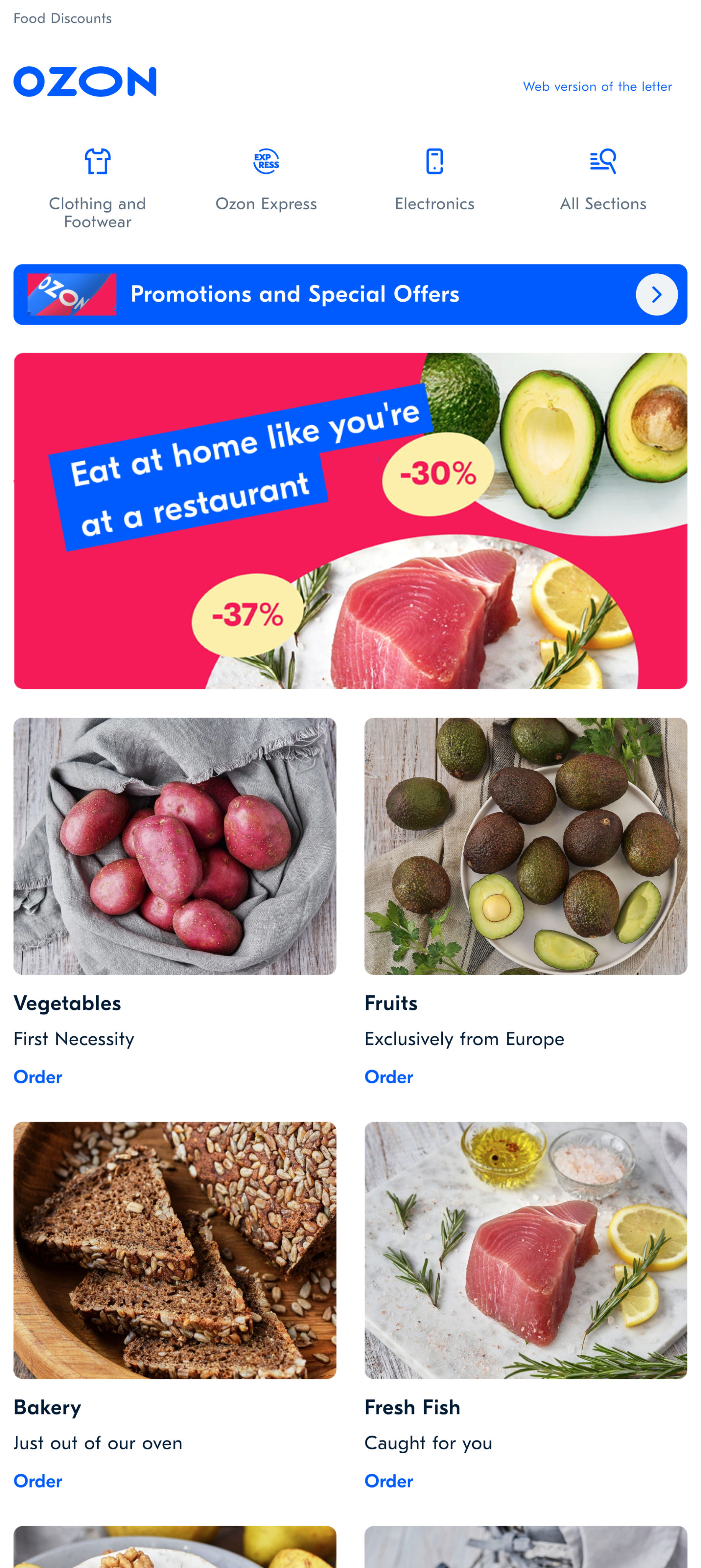
Left: A standard email about an order that does not take considerable development time. Right: A creative email that may take up to two weeks to design, develop, and launch.
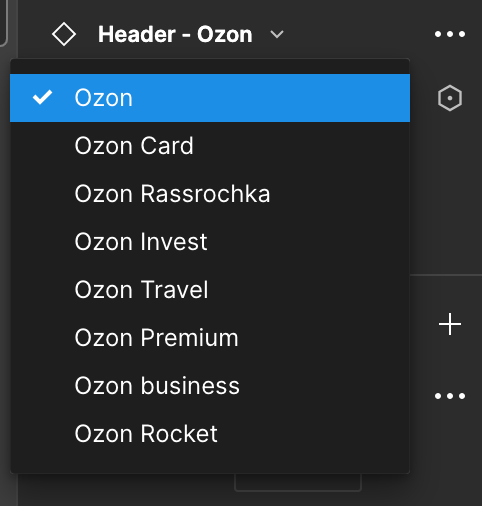
Logos of Company Divisions
Logos can easily be selected from the UI Kit library in Figma, as well as in the admin system. Each product has a single design, along with a special gray color version for dark mode.
Icons
We A/B tested icons v. text, implementing an icon-based design based on the results. Our continual testing efforts led to the pioneering of a dynamic system where icons change based on a user's interests and order history.
Example of dynamic icons in an email header.
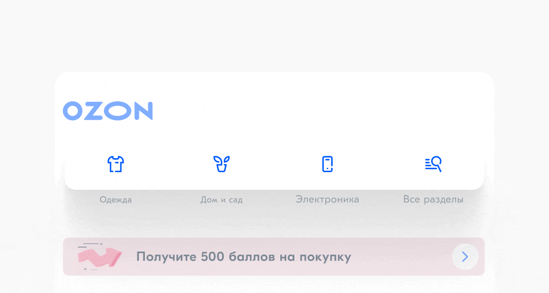
Dark Mode
To support dark mode, we replaced all icons and logos with SVG. We also informed designers that components need to be saved in 2x format so that they do not get blurred on a retina display.
Training and Implementation
Over three months, I trained designers from all departments on using standardized fonts, spacing, and components. I showcased how existing emails could be recreated with templates. This unified system reduced production time from two weeks to two days and significantly improved brand consistency.
We also reached an analytical milestone by visualizing the full email queue, which later helped us optimize frequency and avoid over-emailing users.
A fragment of the UI Kit and an example of the email.
Footer or a place in the sun
Through A/B testing, we discovered that a significant number of clicks occur in the footer of the email, specifically on the icons. We tested and selected stylish 3D icons to replace the old 2D versions. Each icon has its own unique style while remaining consistent with the overall brand.
Example: How to Easily Build an Email — Even for a New Delivery Category
The Ozon Fresh branding fit seamlessly into all the blocks, showing that everything was thoughtfully designed down to the smallest detail.
We set this goal ourselves. We planned to build a banner builder but aimed higher. After users and teams interviews, we broke the task into smaller parts and started creating blocks. It wasn’t easy.
This project changed my perspective and sharpened my design eye. Now, if a logo isn’t in SVG or PNG, fonts are misaligned, or dark mode isn’t considered — I see it as a reflection of the company’s maturity. Gathering extensive user feedback taught me a lot.Spending a summer teaching and consulting with managers brought me closer to my company — we truly became one big team.
The email builder saved us time and money
The idea for the email builder emerged while we were testing blocks. Developers were tired of coding inconsistent “creative” emails, and many lacked a unified style or tone. We created a voice guide, trained the team, and after launch, replaced all third-party tools with our own. It was a big and exciting shift.
✅ Done
- The graphic designer only created visuals to drop into the containers — the email itself was built by the manager, and all banner sizes were already defined in the email UI kit.
- The manager could log into the admin system, set up the email queue, and choose the type of email — all on her own.
- No improvising — everyone follows our guidelines, and new blocks are only added after thorough testing and careful selection.
- No developers needed — we built everything, and it all runs on its own.
Ozon, one of the largest marketplaces in Europe, serves over 32 million customers each month and processes more than 2 million orders per day. This means that over 60 million orders go through the platform monthly, which implies that Ozon sends around 60 million emails per month related to orders alone.
Key Learnings
The email project made me well-known within the company. Whenever something involved emails, people would say, “Ask Olga from Brand.”
This project taught me how to communicate across cross-functional teams and connect people from different departments. I even created a training course on how to build effective emails, wrote an article based on our research, and presented the results at tech conferences.
I developed hypotheses and validated them through testing with real users. The project is still evolving and growing, but I’m proud that my name will be remembered in the company’s history as the creator of this tool.
Credits
Olga Kusterer
I led the project as a Product Designer, and later as a Senior Product Designer.
Philipp Shprints
Lead Copywriter who Created Copywriting and User Communication Guidelines.
Tatyana Delyagina
Worked on the illustrations and also developed the iconography guidelines.
Tatyana Delyagina
Head of the development team who contributed to the creation of the email builder.
Alexander Alekseev
Brand Design – Banner Guidelines.
Maria Ananina
Project Manager and Team Lead.
Olga Kusterer
Main page
→
Resume
→
Email builder
The admin system for creating and sending all types of emails reduced business expenses by eliminating the need for subscriptions to third-party email services.
Email marketing was a key sales channel for Ozon, but design inconsistencies across teams hurt the brand. I developed a unified tool to standardize email templates—fonts, colors, formatting, and logos—replacing multiple third-party services. This was part of our global rebranding initiative.
Creating an Email Now Takes 15 Minutes Instead of 2 Weeks!
Project Objective
As we began our global rebranding, we saw an urgent need to improve customer emails. With 14 product categories managed by different teams, users were receiving too many emails, too often. Each team used its own third-party tools, making analytics and quality control difficult.
Designers and developers also had to build each email manually, wasting time on repetitive layout work. Some managers added custom signatures or festive designs, often straying from brand guidelines.
My Role
I was tasked with redesigning our email layouts and developing an intuitive email builder. This involved the following steps:
- Creating a master library containing blocks, font pairs, buttons, and letter structure templates.
- Designing and testing email headers, bodies, and footers, including iterative adjustments to ensure a style consistent with our branding principles.
- Developing the email builder, which templates the majority of the email creation process.
- Providing training sessions on how to use the new tool, as well as to better understand our brand principles.
Challenges
- Inconsistent Design: Colors, buttons, typography, and tone varied across emails — creating a fragmented brand experience.
- Decentralized Workflow: 14 departments handled emails independently, resulting in disjointed communication that didn’t feel like one company.
- Slow Production: Email creation took up to two weeks from concept to send.
- Missing Features: No support for dark mode or SVGs — both critical for modern email standards and user expectations.
📬 Main Email Categories in Ozon
I began by meeting with team leads to map out all email types used across the company. Then, I worked with the research team to analyze which content blocks performed best and which emails drove measurable results. I also reviewed user feedback from social media and email-specific comments. To coordinate the process, I created detailed Jira tasks with clear step-by-step instructions and added all stakeholders as watchers.
14 different departments were sending emails. We needed to make them all consistent. I met several times with different development leads to discuss the creation of the admin system and successfully pushed the task into the top priority projects needed by the business.
The final email designs.
Then, I made a single design ( UI Kit )
Sample of promotional components.
To unify our email marketing, I created an integrated style guide covering colors, headers, buttons, logos, and fonts. I also defined the placement of banners, collages, promo codes, and other visual elements. Each content block was designed with precise dimensions to ensure clean alignment. I carefully selected font pairings to make the content easy to scan and highlight the most important information in each email.
Left: A standard email about an order that does not take considerable development time. Right: A creative email that may take up to two weeks to design, develop, and launch.
Logos of Company Divisions
Logos can easily be selected from the UI Kit library in Figma, as well as in the admin system. Each product has a single design, along with a special gray color version for dark mode.
Icons
We A/B tested icons v. text, implementing an icon-based design based on the results. Our continual testing efforts led to the pioneering of a dynamic system where icons change based on a user's interests and order history.
Example of dynamic icons in an email header.
Dark Mode
To support dark mode, we replaced all icons and logos with SVG. We also informed designers that components need to be saved in 2x format so that they do not get blurred on a retina display.
Training and Implementation
Over three months, I trained designers from all departments on using standardized fonts, spacing, and components. I showcased how existing emails could be recreated with templates. This unified system reduced production time from two weeks to two days and significantly improved brand consistency.
We also reached an analytical milestone by visualizing the full email queue, which later helped us optimize frequency and avoid over-emailing users.
A fragment of the UI Kit and an example of the email.
Footer or a place in the sun
Through A/B testing, we discovered that a significant number of clicks occur in the footer of the email, specifically on the icons. We tested and selected stylish 3D icons to replace the old 2D versions. Each icon has its own unique style while remaining consistent with the overall brand.
Example: How to Easily Build an Email — Even for a New Delivery Category
The Ozon Fresh branding fit seamlessly into all the blocks, showing that everything was thoughtfully designed down to the smallest detail.
We set this goal ourselves. We planned to build a banner builder but aimed higher. After users and teams interviews, we broke the task into smaller parts and started creating blocks. It wasn’t easy.
This project changed my perspective and sharpened my design eye. Now, if a logo isn’t in SVG or PNG, fonts are misaligned, or dark mode isn’t considered — I see it as a reflection of the company’s maturity. Gathering extensive user feedback taught me a lot.Spending a summer teaching and consulting with managers brought me closer to my company — we truly became one big team.
The email builder saved us time and money
The idea for the email builder emerged while we were testing blocks. Developers were tired of coding inconsistent “creative” emails, and many lacked a unified style or tone. We created a voice guide, trained the team, and after launch, replaced all third-party tools with our own. It was a big and exciting shift.
✅ Done
- The graphic designer only created visuals to drop into the containers — the email itself was built by the manager, and all banner sizes were already defined in the email UI kit.
- The manager could log into the admin system, set up the email queue, and choose the type of email — all on her own.
- No improvising — everyone follows our guidelines, and new blocks are only added after thorough testing and careful selection.
- No developers needed — we built everything, and it all runs on its own.
Ozon, one of the largest marketplaces in Europe, serves over 32 million customers each month and processes more than 2 million orders per day. This means that over 60 million orders go through the platform monthly, which implies that Ozon sends around 60 million emails per month related to orders alone.
Key Learnings
The email project made me well-known within the company. Whenever something involved emails, people would say, “Ask Olga from Brand.”
This project taught me how to communicate across cross-functional teams and connect people from different departments. I even created a training course on how to build effective emails, wrote an article based on our research, and presented the results at tech conferences.
I developed hypotheses and validated them through testing with real users. The project is still evolving and growing, but I’m proud that my name will be remembered in the company’s history as the creator of this tool.
Credits
Olga Kusterer
I led the project as a Product Designer, and later as a Senior Product Designer.
Philipp Shprints
Lead Copywriter who Created Copywriting and User Communication Guidelines.
Tatyana Delyagina
Worked on the illustrations and also developed the iconography guidelines.
Ilya Myasin
Head of the development team who contributed to the creation of the email builder.
Alexander Alekseev
Brand Design – Banner Guidelines.
Maria Ananina
Project Manager and Team Lead.